Apples to Apples: London Underground Map Update
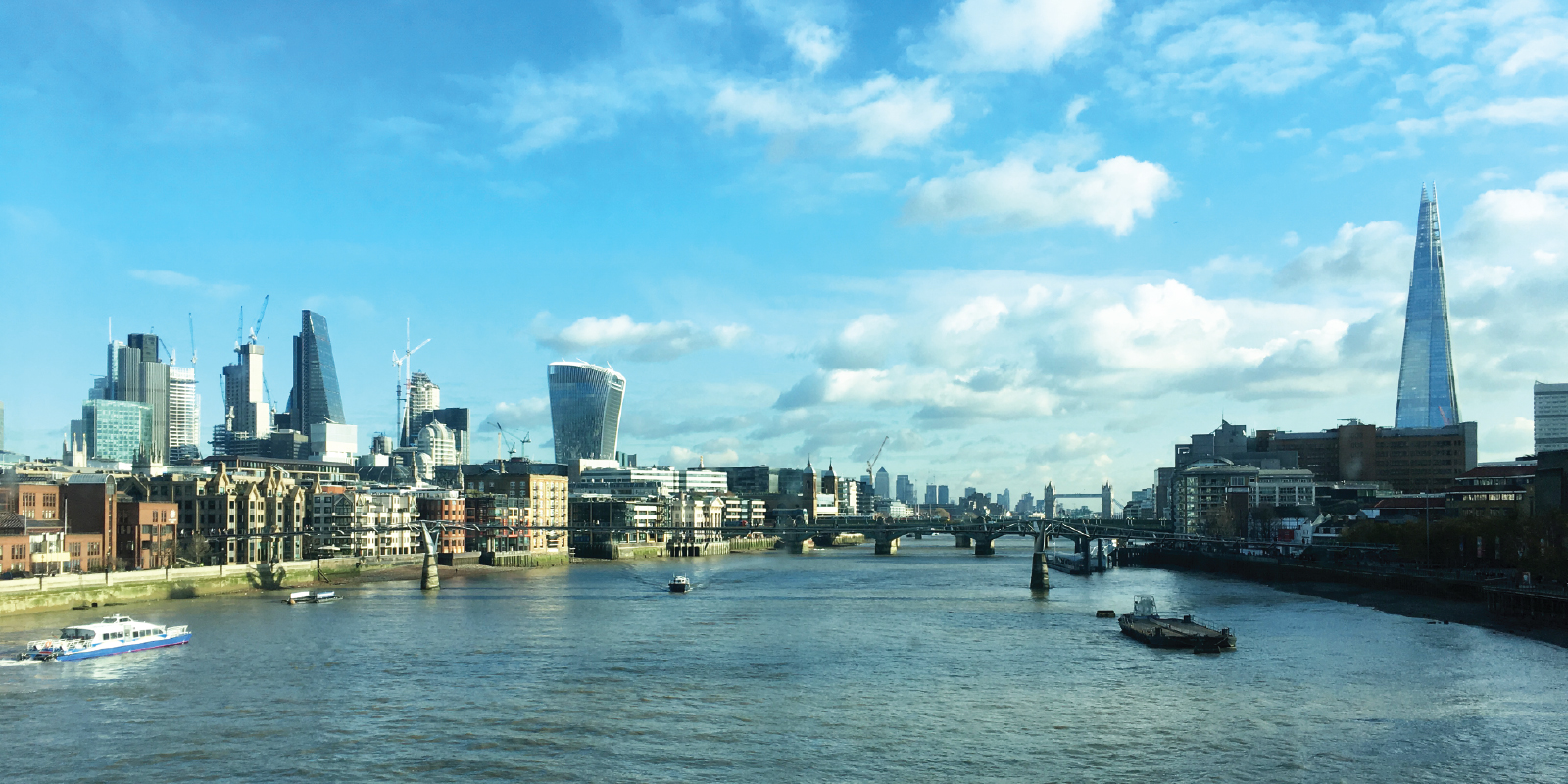
The London underground map used to be an outstanding artwork, an iconic XXth century design that has set the standard for schematic mapping worldwide. Unfortunately numerous additions and tweaks to the map over the years have altered its original neatness and consistency and downgraded it to the status of an average diagram.
The main issues as of today are:
- Meandering shades of grey that represent fare zones clutter the visual field
- Rail lines that constitute a huge part of the urban network are not shown on the main tube map. On the dedicated Rail and Tube Services Map their rendering lacks structure, balance, and consistent aesthetics.
- Overground and DLR services are not distinguished making journey planning and wayfinding difficult.
It seems legitimate at the beginning of the XXIst century to attempt to update the underground map by addressing these issues while preserving the original graphic conventions and bring it back its lustre.
The map below is a personal attempt at tackling this challenge. The layout is based on the inat London Underground Map that I have been updating an refining over the years but this time the graphic style is the traditional Londonian one with ticks and blobs.
London Underground Map Update
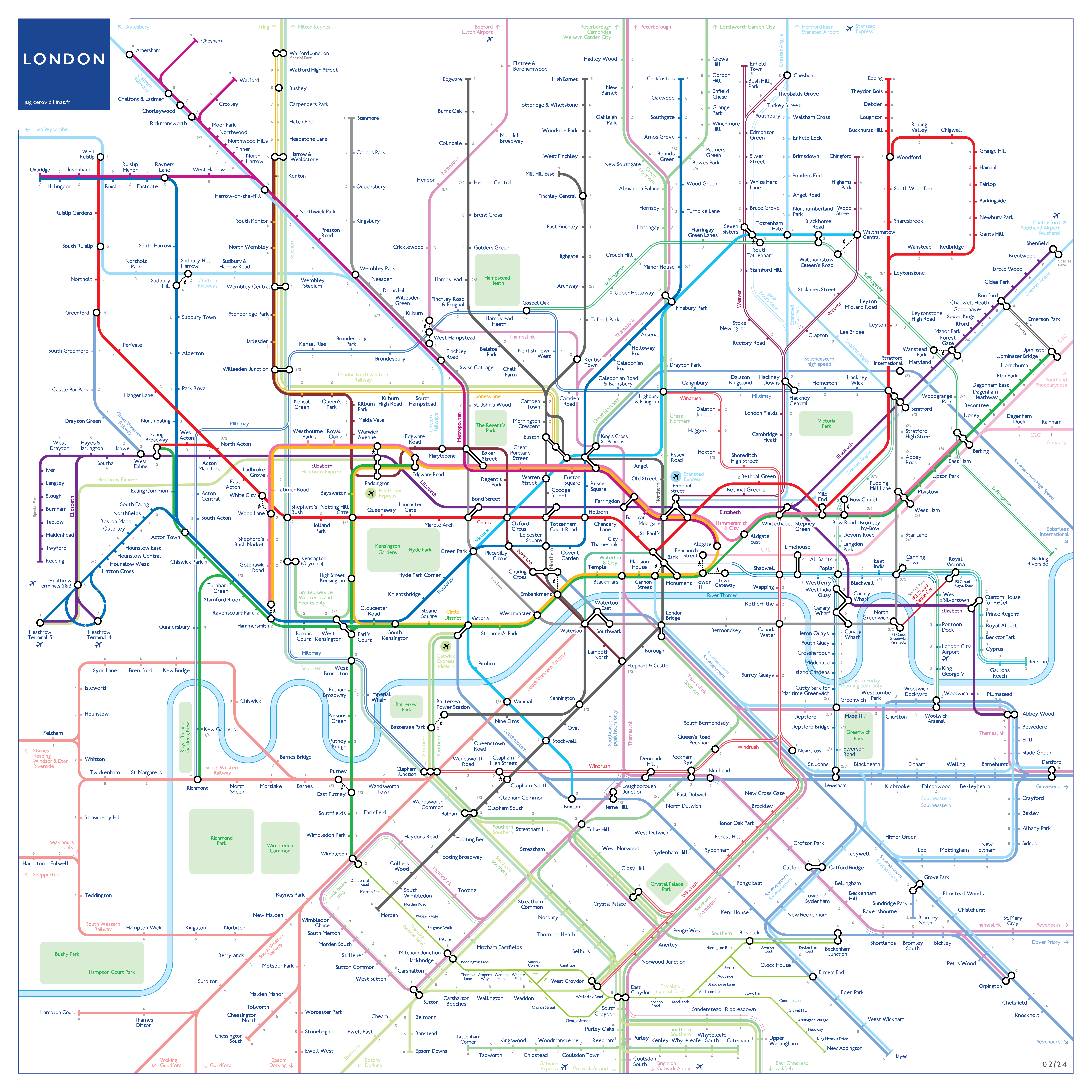
Neat, consistent, beautiful.
More about the design process:
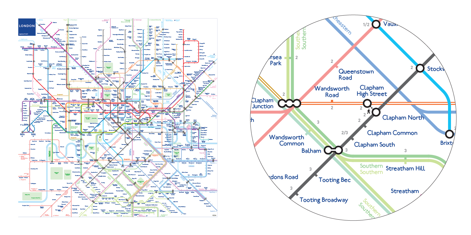
1. Legacy Graphic Style
Preserve legacy aesthetics
45° angles
Ticks for stations
Blobs for interchanges
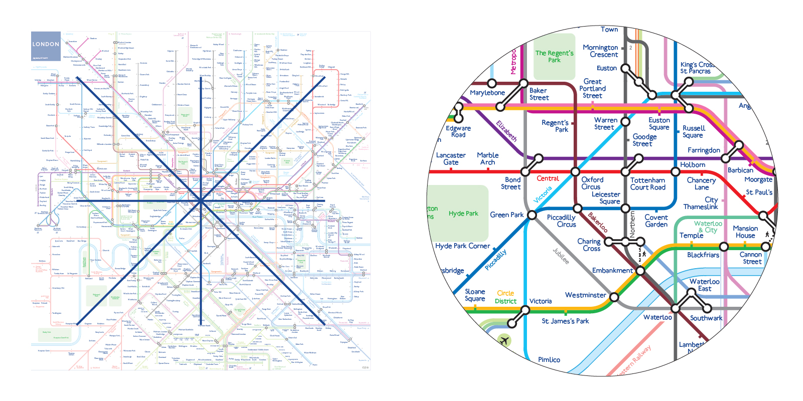
2. Underground lines
Expanded Central London
Lines are set on a regular orthogonal grid
Condensed periphery
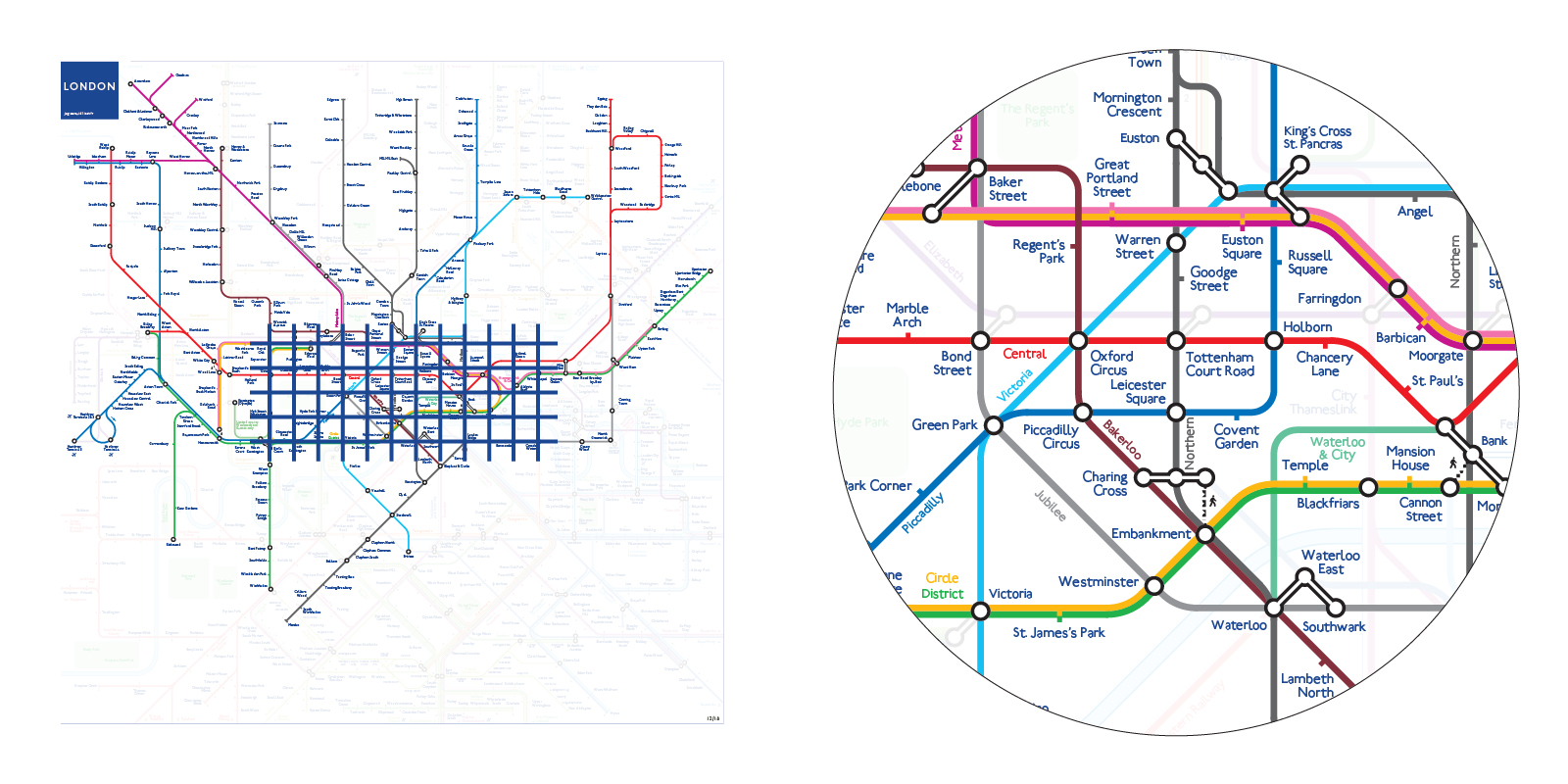
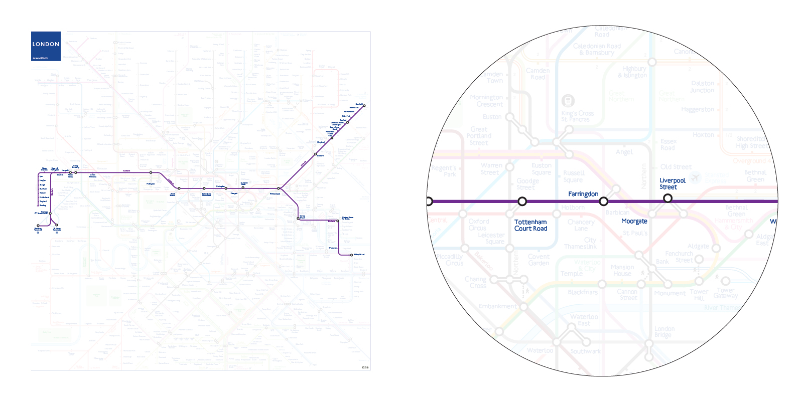
3. Crossrail/Elizabeth Line
Straight line through most of Central London
Emphasized connectivity with detailed interchanges
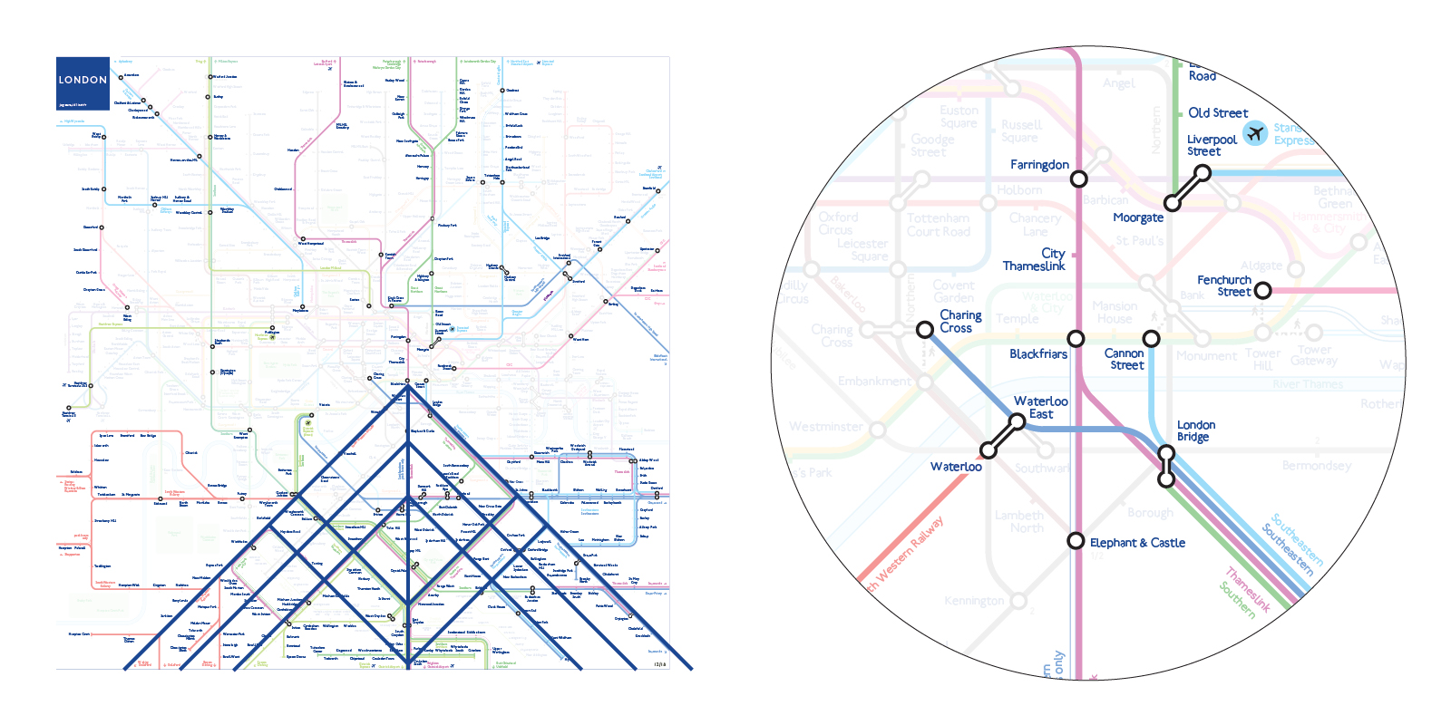
4. Rail lines
All rail lines are shown on the map
Regular and symmetric structure South of the Thames
Lines are color coded according to their Central London Terminus:
- Southeastern to Charing Cross: dark blue
- Southeastern to Cannon Street: light blue
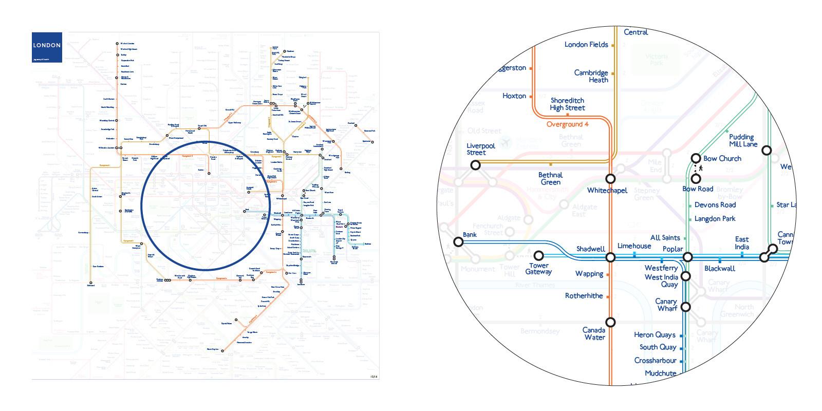
5. Overground and DLR
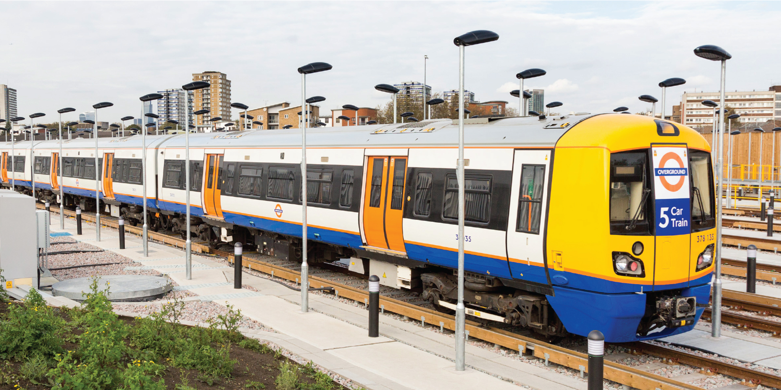
Overground forms an orbital network around Central London
Docklands Light Railway forms a radial network to the East
Different services are shown as separate lines with dedicated colors
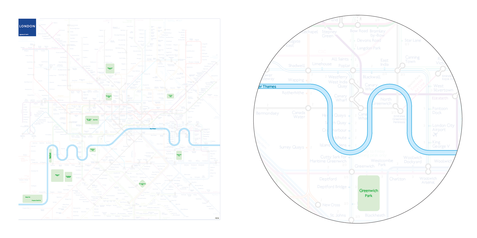
6. Cityscape
River Thames with all its bends
Main Parks for intuitive wayfinding
No shades of grey for zones, small grey numbers instead
7. Information Hierarchy
All components of the map are organized hierarchically, from top to bottom:
Lines-Connectivity-Wayfinding-Complements
LINES
- Underground lines on top with bright colors
- Overground and DLR
- Rail lines with lighter colors
CONNECTIVITY
- Interchange blobs
- Out of system transfers shown with a dotted line and a pedestrian icon
WAYFINDING
- Station Ticks
- Station Labels
- Line Names
- River Thames
- Parks
- Airport directions
COMPLEMENTS
- Zone numbers adjacent to each station Label or tick
- Airport links
- Tramway
- Cable Car
The typeface used on the map is Railway Sans, an open-source interpretation of Johnston's original by Justin Howes and Greg Fleming.
The map represents the network as it should have been with the inauguration of Crossrail in December 2018.
Consistency, innovation and tradition blended into an iconic design.
Zoom on the map to see details

Author:
Jug Cerovic
September 2018
Print Shop
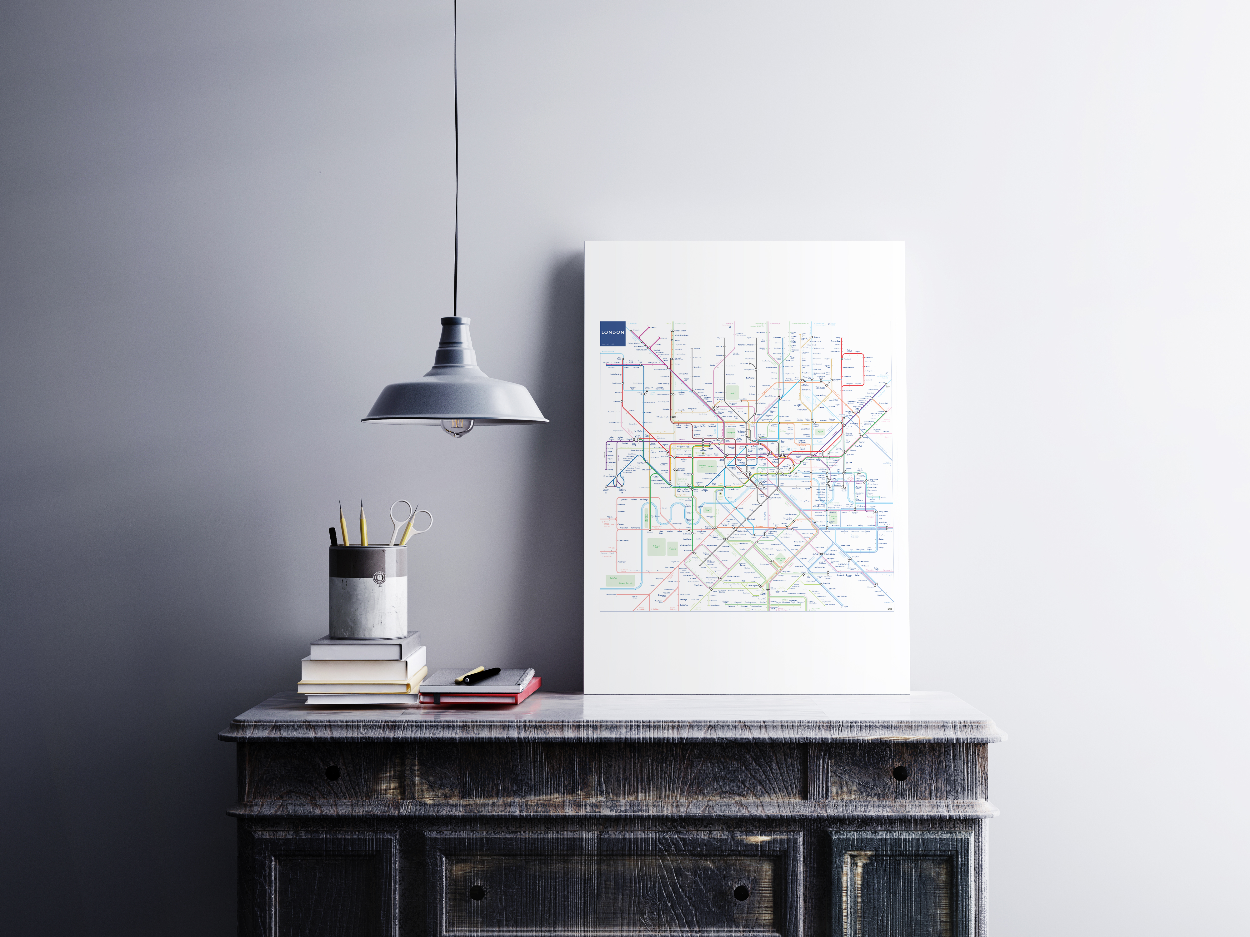
Order art prints, posters, scarves, pillows...
Book Shop
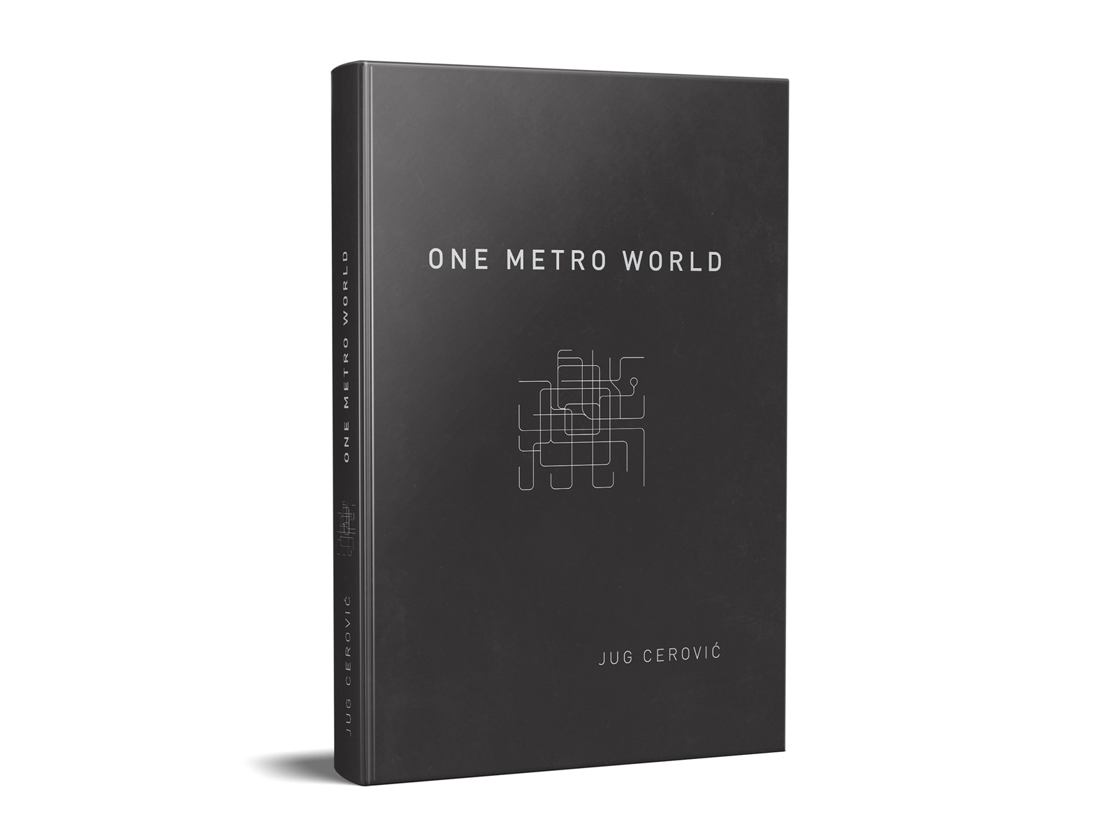
One Metro World
An atlas of schematic metro maps
Paperback
8.5" x 11" (21.59 x 27.94 cm)
Full Color on White paper
160 pages
39$
Shipping worldwide, order online on Amazon
