Dubai Metro + Bus map
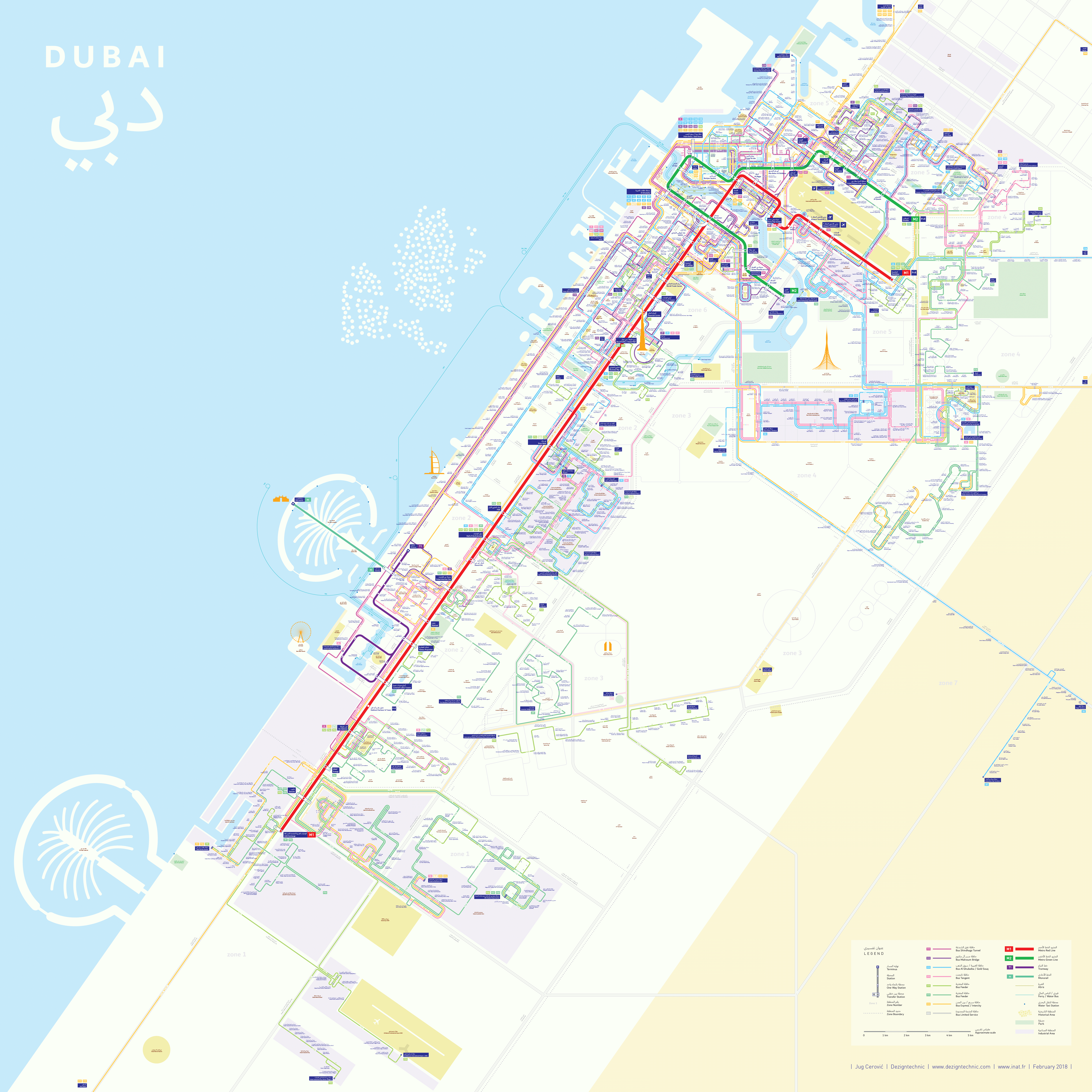

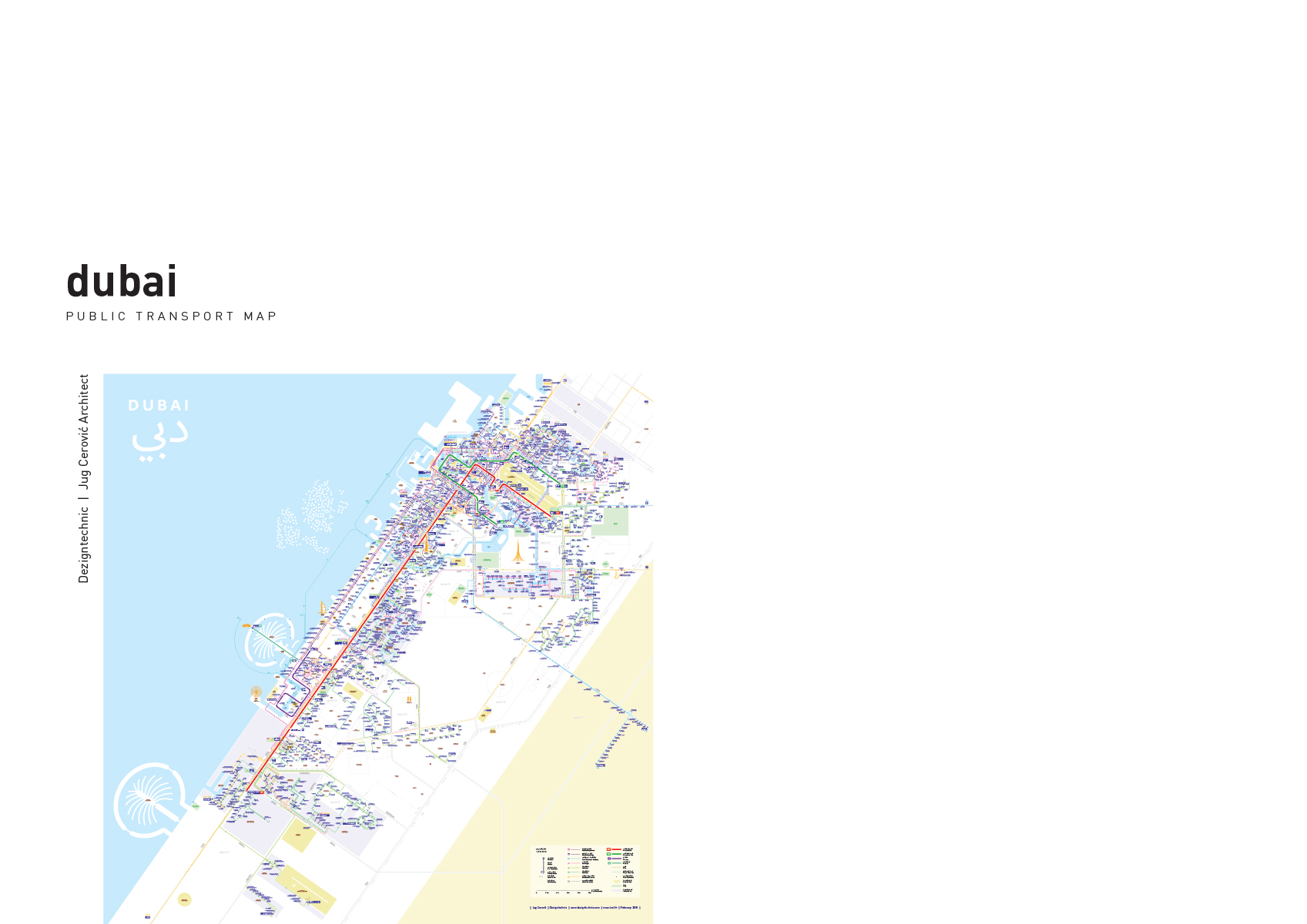
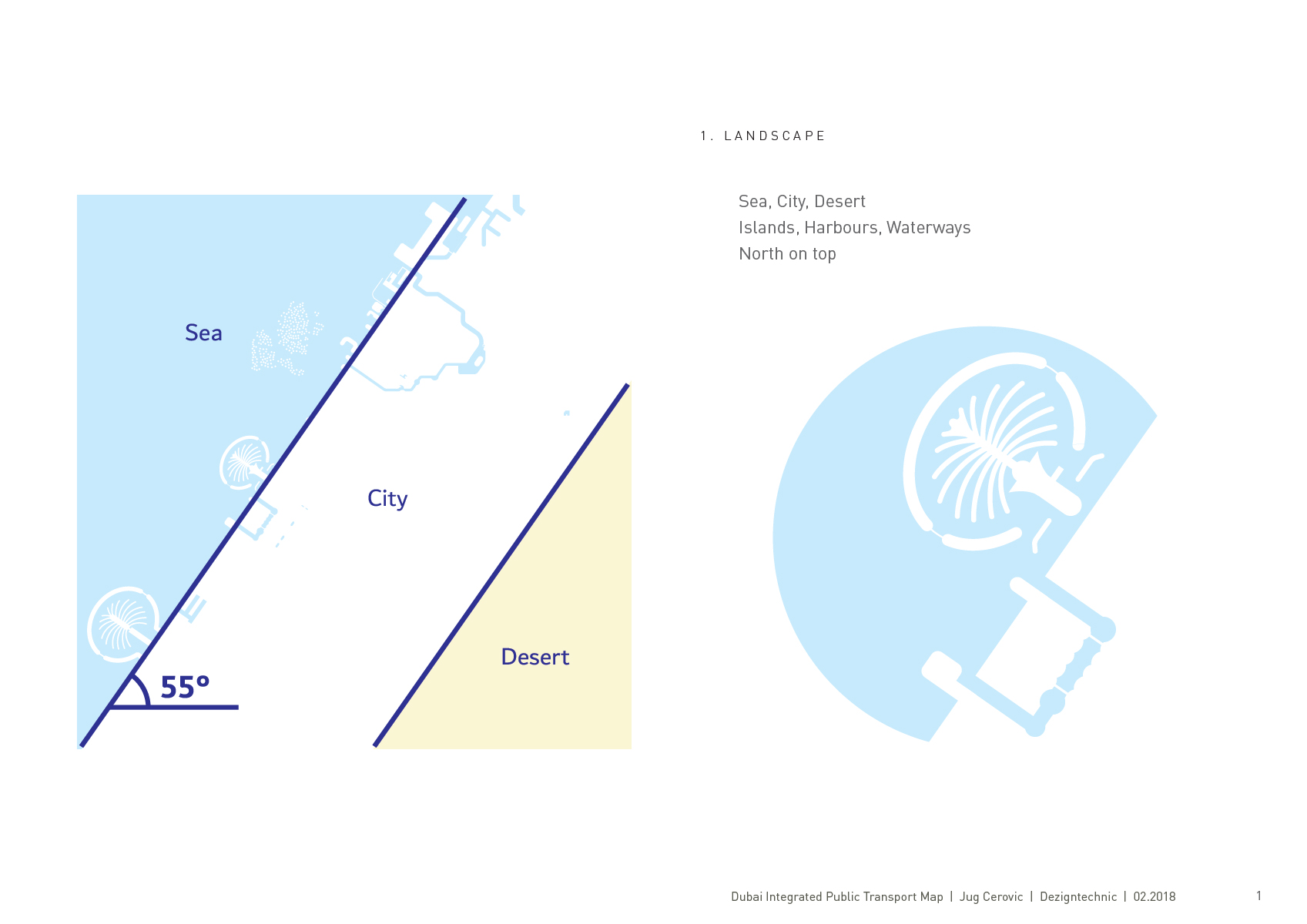
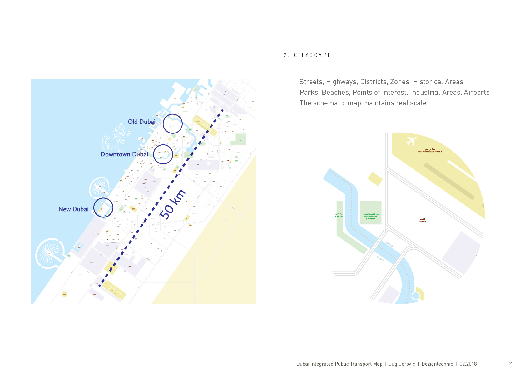
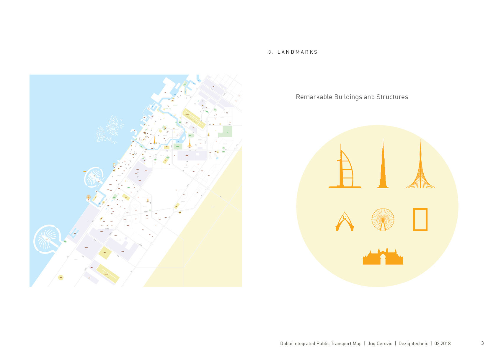
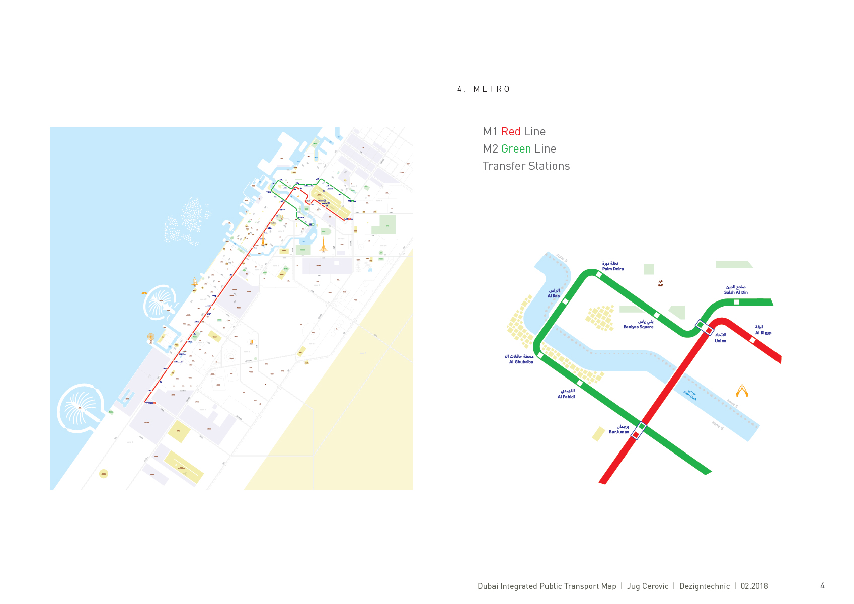
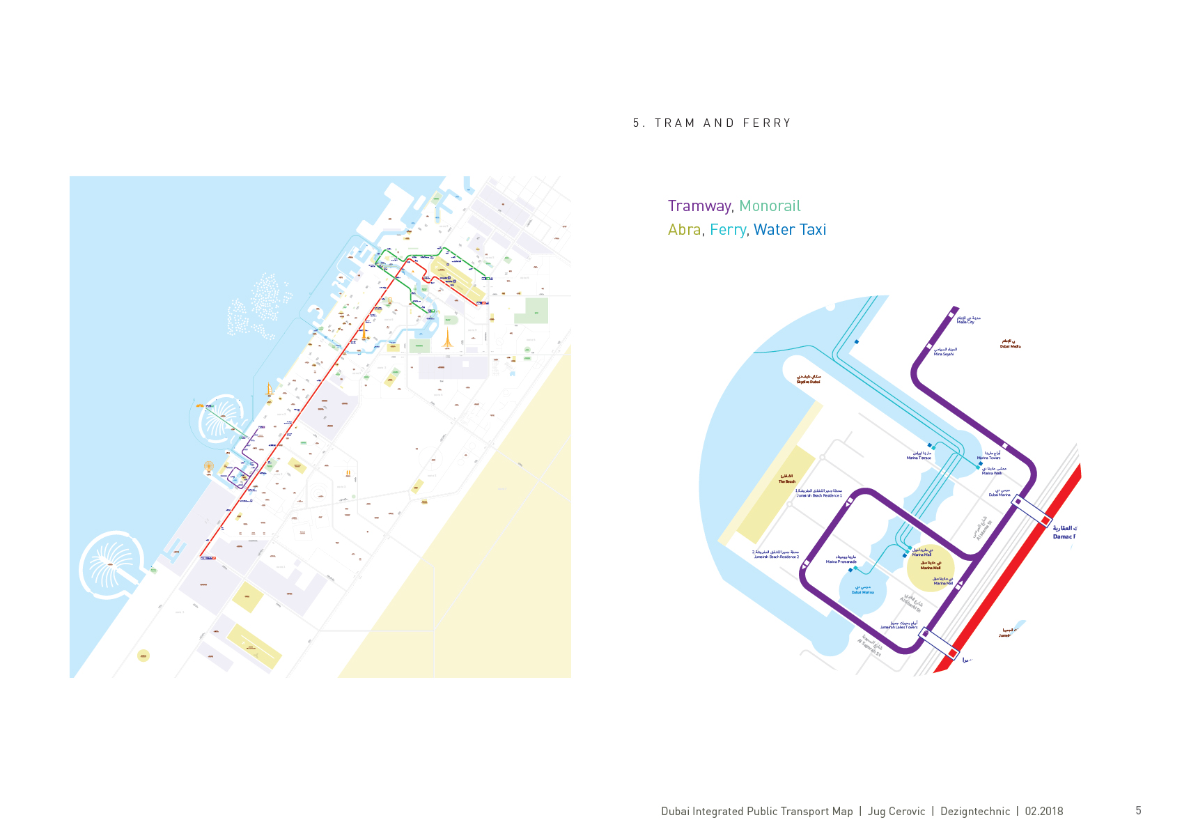
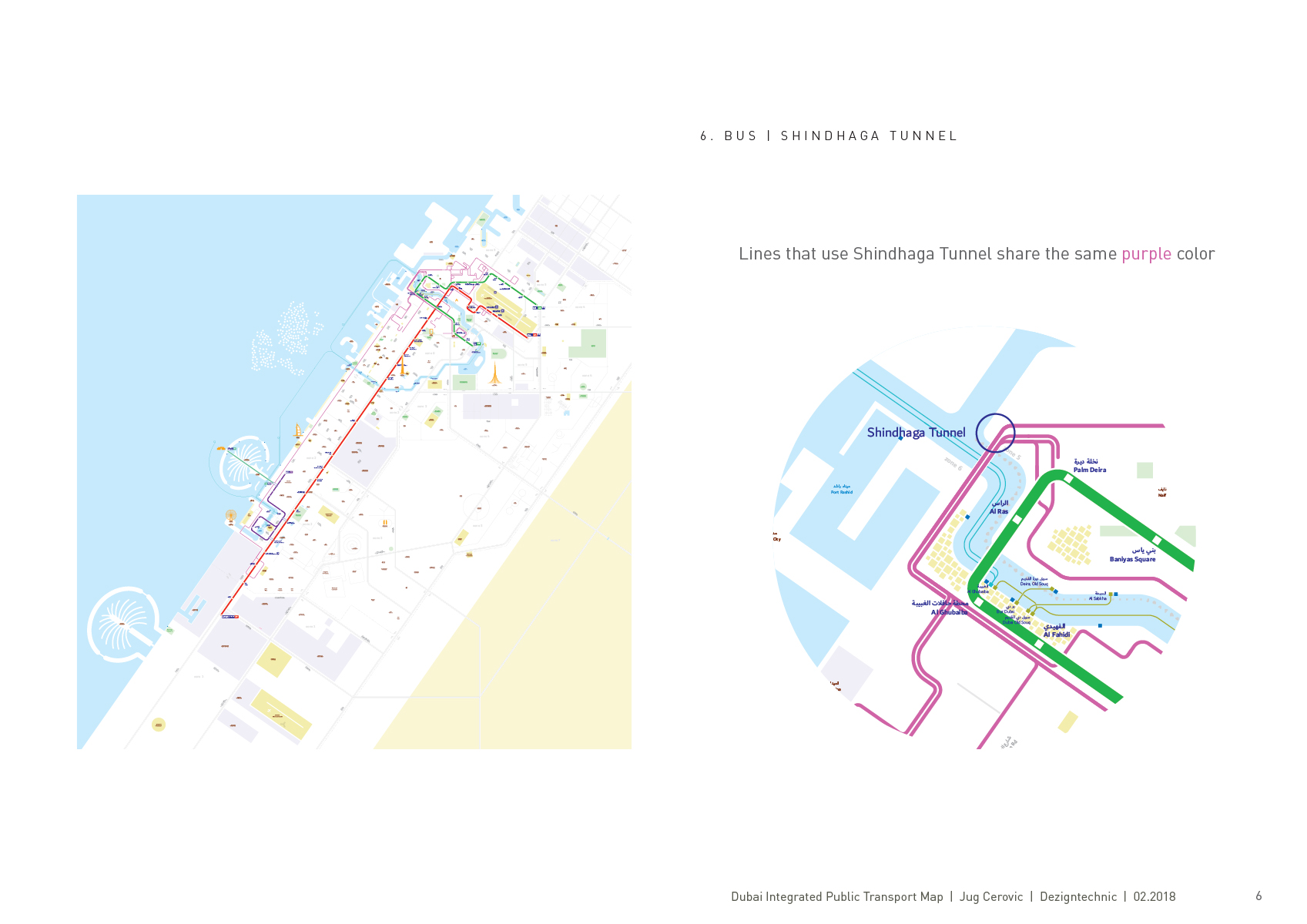
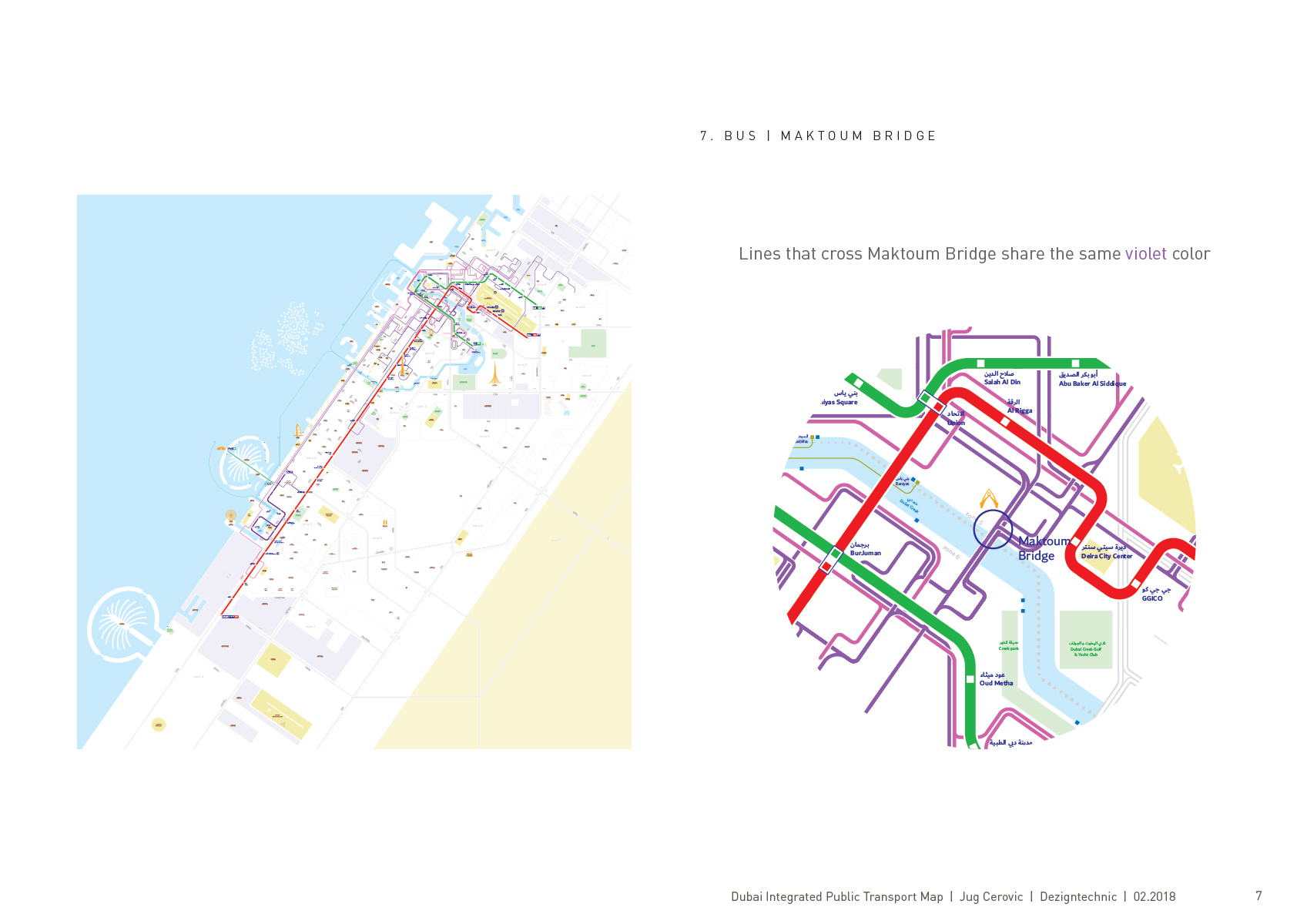
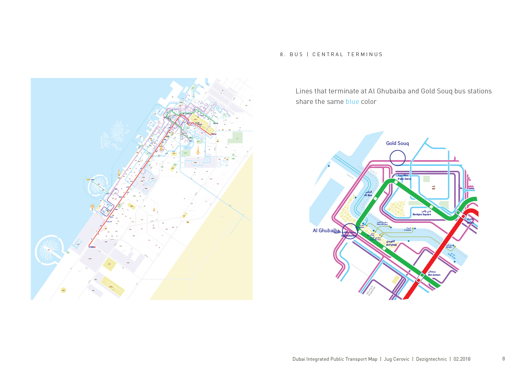
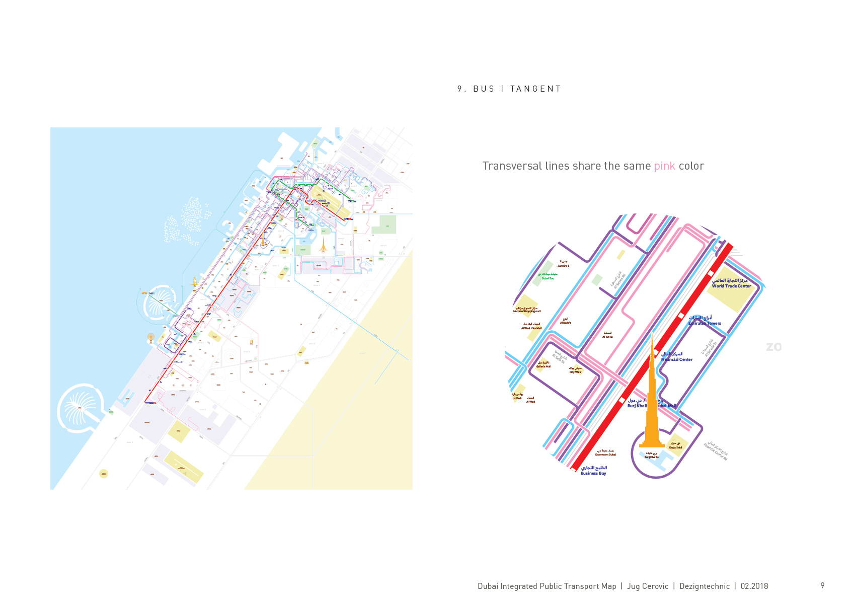
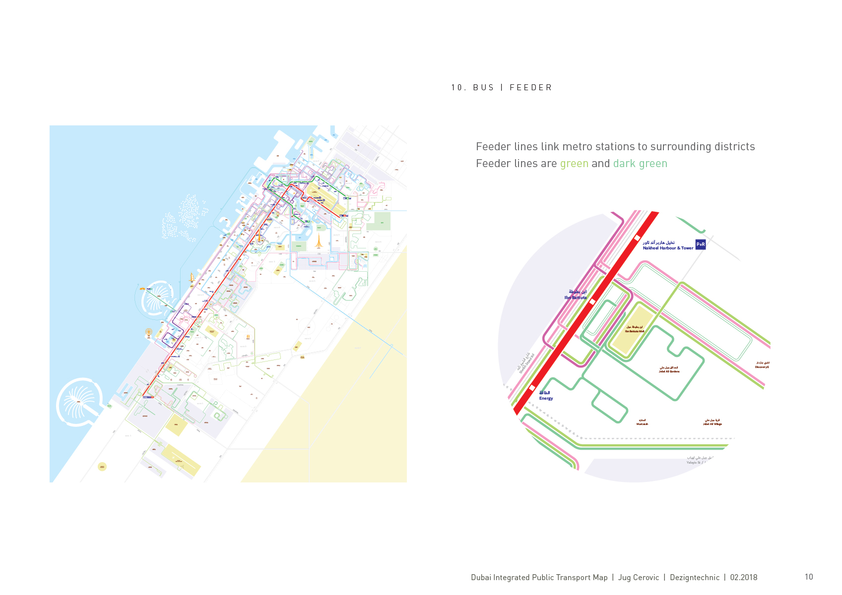
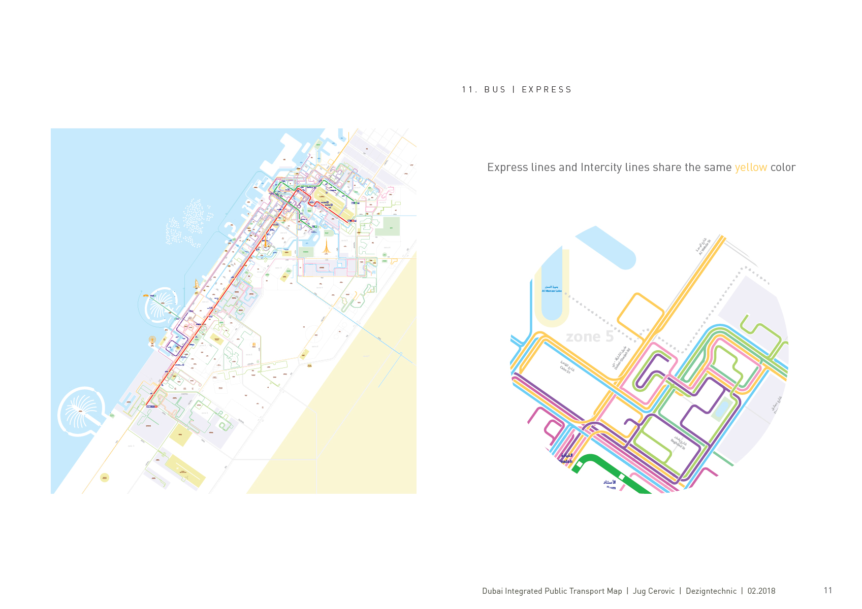
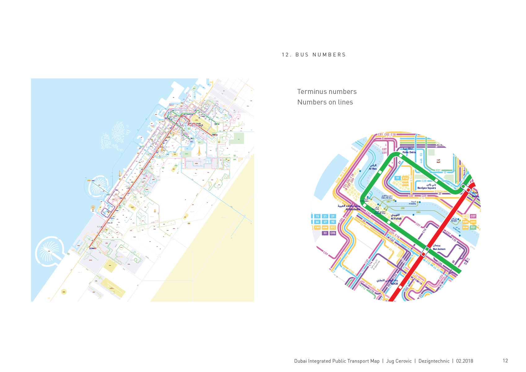
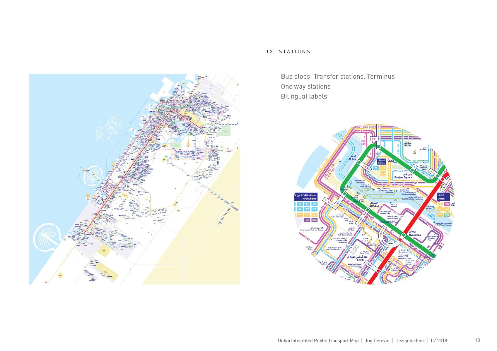
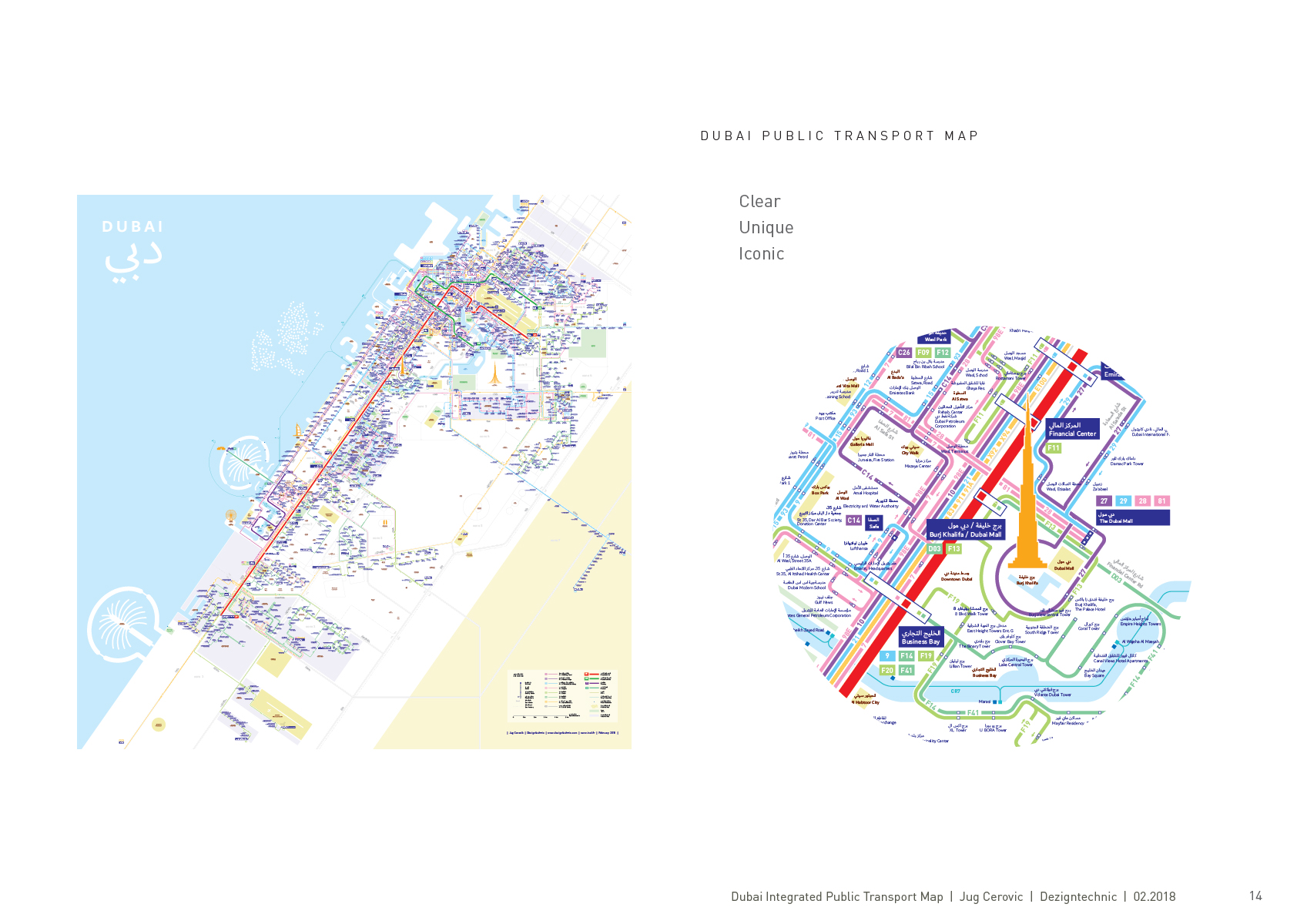
Comprehensive and detailed map of the entire public transport network. All lines, stations, one way stations, numbers, landmarks, remarkable areas. The map is schematic but the overall scale over 60km is respected. The layout is divided in three colors/areas: blue/sea, white/city, yellow/desert.
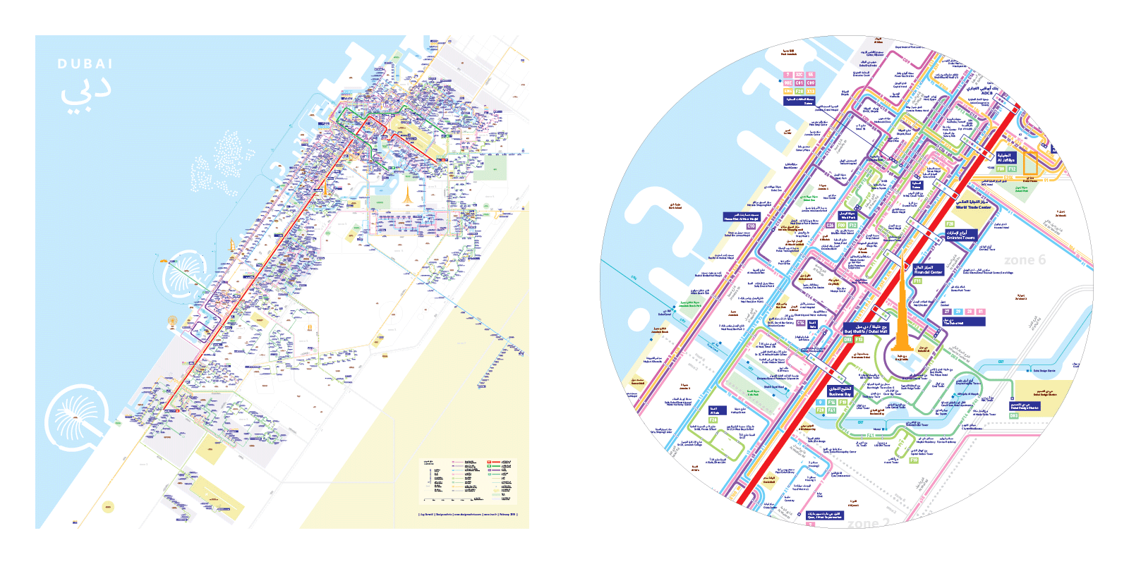
See full resolution pdf (6Mb) here
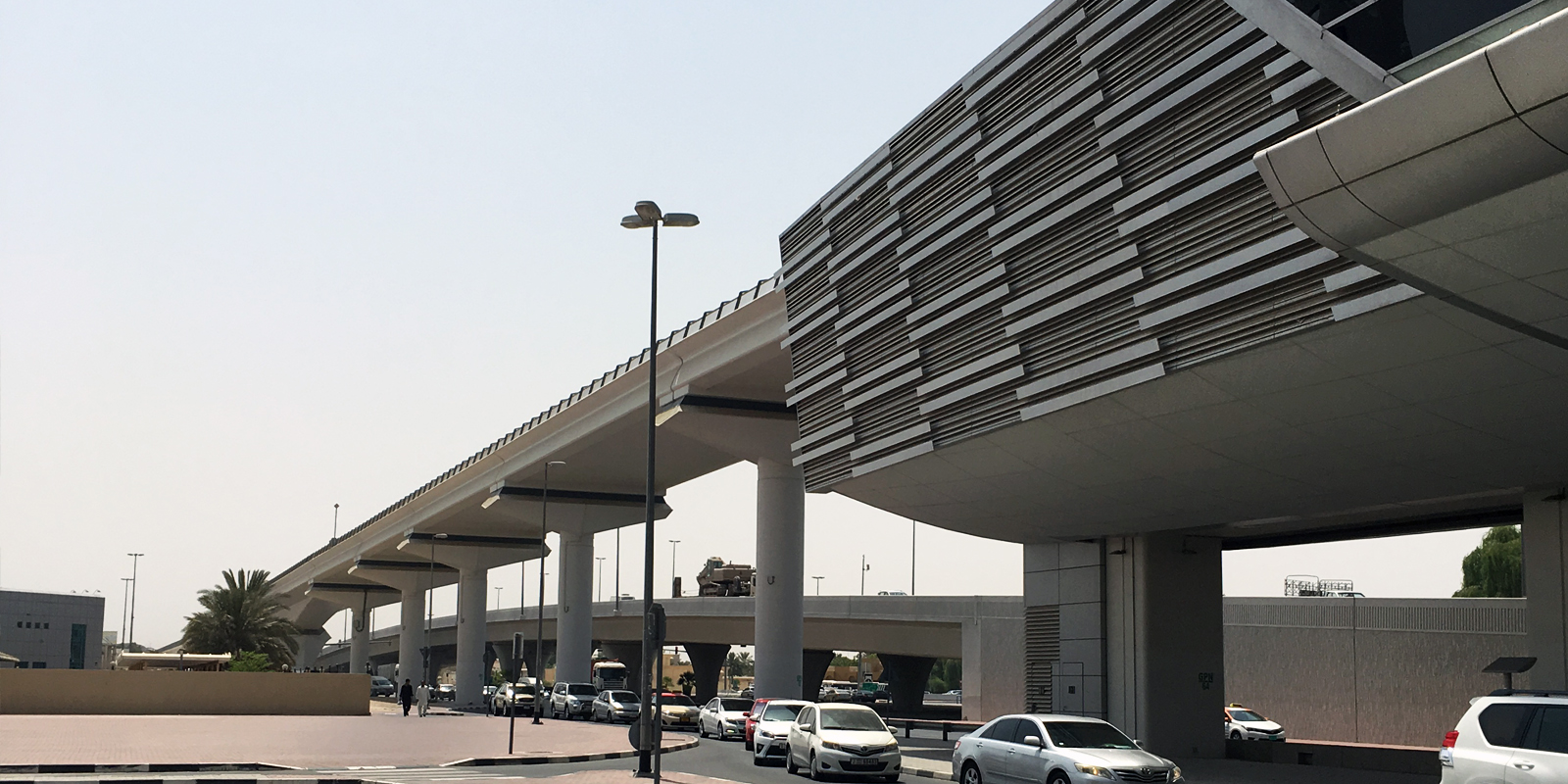
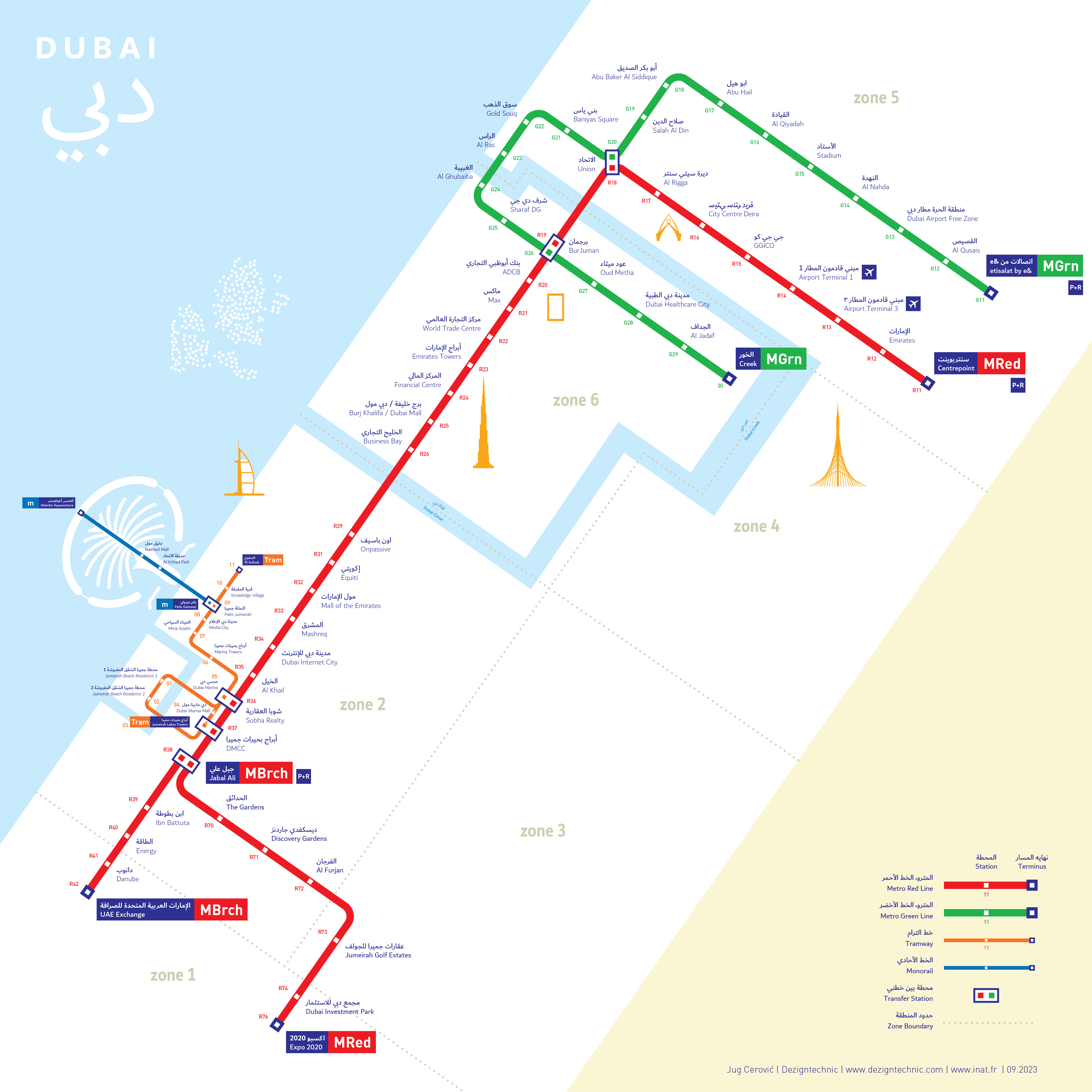
Dubai Metro Map

Essential landscape shapes, main landmarks, metro lines, pocket size.
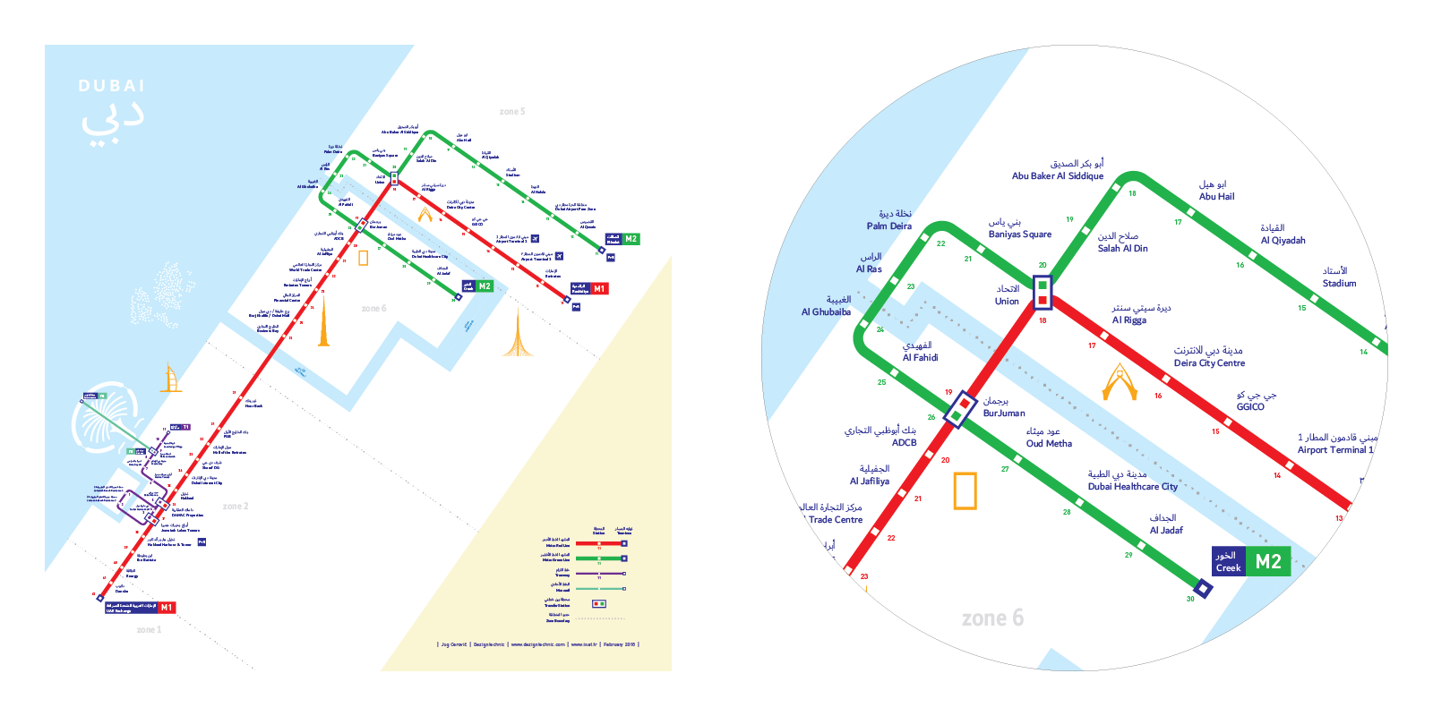
See full resolution pdf (250Kb) here
An iconic map of Dubai, made in Dubai, offered to Dubai.
About the map
A tailor built schematic map revealing the inner flows of a bustling metropolis in all its beauty, complexity and potentiality.
The map doesn't only show what there is but also what could be, it illustrates reality and hints at potentiality.
Our approach is based on a global experience, an extensive knowledge of the territory and a multilayered network data analysis.
Our goal is to create an artwork that combines a reliable tool with a poetically inspirational design.
About us
This achievement is the result of the newly formed partnership between signage and wayfinding consultancy DezignTechnic (Dubai) and mapping expert architect Jug Cerovic (Paris).
We have embraced the challenge of mapping Dubai to demonstrate our unique combined capacity, skills and ambition.
On the path towards building a worldwide reputation of excellence we have started by being fully confident at home.
It is thus with great pride and modesty that we offer this map to the emirate of Dubai.
Q&A
Why are you making maps? With the availability of Google maps today who is still interested in buying a map?
A map is not only an information diagram, it is a subjective communication tool. It shows only data that you chose to display on it and highlights elements you desire to emphasize.
Google is not the only online mapping platform around, there are many others like Here, Apple and OpenStreetMap, yet none of them will show you an entire bus network in all its details and intricacies.
This is because none of them is able today to generate such a map in an automated way, this task still requires expert human design. We succeed in this challenge by producing tailor made, hand crafted maps that rely on human talent.
What are you looking to build on the success of this map?
We want to demonstrate our ability to analyze a complex system, disentangle it and then portray it in an intuitive and intelligible way. This graphic representation of the system in the form of a map is then used to promote, navigate or optimize an otherwise intangible system and allow unskilled users to easily interact with it.
Complex systems can take a variety of shapes - a transport network, a university campus, a corporate organization - and we provide custom wayfinding tools for understanding and navigating them.
What makes your map different than any other map?
Our Dubai Metro + Bus map is:
- Comfortable
Easy to read, the map conforms to scale, orientation and familiar landscape.
- Comprehensive
The map shows everything you need: all lines, stations, bilingual labels
- Clear
Information is hierarchically organized for an intuitive lecture from top to bottom: metro > landmarks > bus > cityscape > zones
- Trustful
The map explains all particularities of the network, pays attention to crucial information such as one way stations and portrays very complex areas like Karama in great detail.
- Iconic
The neat design and bold identity of the map mirror the modern and efficient organization of the RTA and ambition of the emirate of Dubai
Where would this map be used? Where would RTA use it if they were to?
The map is both natively digital and adapted for print. It will be used online on RTA or other platforms and apps. It can be printed and placed at every bus shelter for users' convenience in everyday commutes.
What problems does your map address and what solutions does it bring?
We address the dis-balance that often appears between the excellence of a system's design and its poor perception from the outside point of view.
Complex systems such as transportation networks cannot be grasped at a glance the way one would embrace the pattern of a city from the air. They are built as an intangible network of nodes and flows and require a graphic representation in order to be grasped and used. Elements that are not portrayed in a neat manner simply do not exist for the average user. New lines, infrastructure, vehicles or other investments remain invisible until they are illustrated and promoted as part and parcel of the system.
In short, if it's not on the map it didn't happen.
Our wayfinding tools bridge this communication gap. We abstract layers of data into graphic conventions and combine them into one clear schematic image of the system. An image that every user, operator or investor can understand and embrace.
Information hierarchy and engaging design protect the users from being overwhelmed with data and keep them confident and comfortable. We graphically explain how a system functions and show all the possibilities it offers. Our maps illustrate the huge undertakings or investments that would otherwise remain hidden to the non-initiated.
Design Notes
