Belgrade Wayfinding Architecture
New orientation totems for the capital of Serbia
Cities have a dual nature. Just as light has a paradoxical dual nature, it is at the same time a continuous wave and a quantity of particles (photons), such are our metropolises today. They are at the same time tangible and elusive, fixed and variable.
On the one hand they are built out of physical, definite structures and infrastructures (roads, buildings, wires...). On the other hand they are penetrated by countless and evasive flows (transit, information, uses...).
Crafting a tool for city navigation means understanding this dual nature and identifying the relationship between structures and flows.
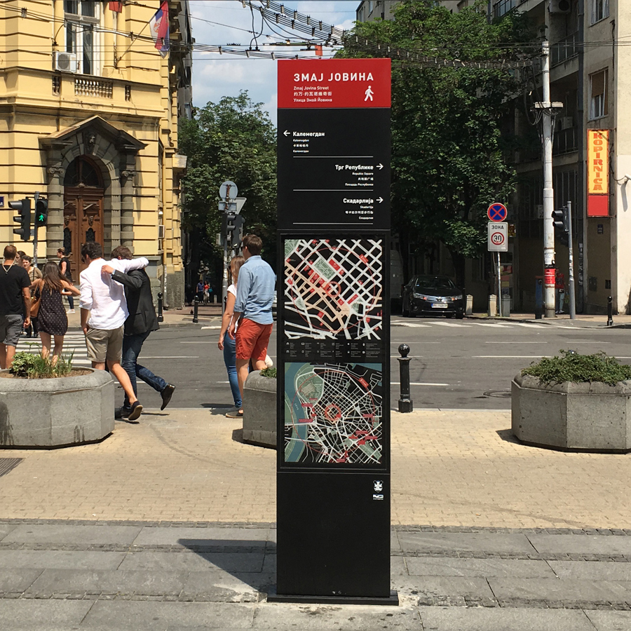
Early in 2017 The Municipality of Belgrade in Serbia tasked Alma Quattro, an outdoor advertising company subsidiary of the global giant JCDecaux, with providing and implementing a set of brand new wayfinding totems for the city center.
Alma Quattro in turn called me in to complete the task, acknowledging my previous work on the city's touristic map and public transport map. I immediately mobilized veterans from our local activist group Imamo Plan and embraced the challenge.

Part 1. Design Brief
The design brief provided by the authorities was precise but allowed enough space for experimentation and innovation. The requirements went as follows:
- 30 black monoliths, dimensions 270 x 57 cm
- Dark red top cap
- Directions in 4 languages: Serbian, English, Chinese, Russian
- Local map centered on location, 5min walk area
- Context map centered on location, 15min walk area
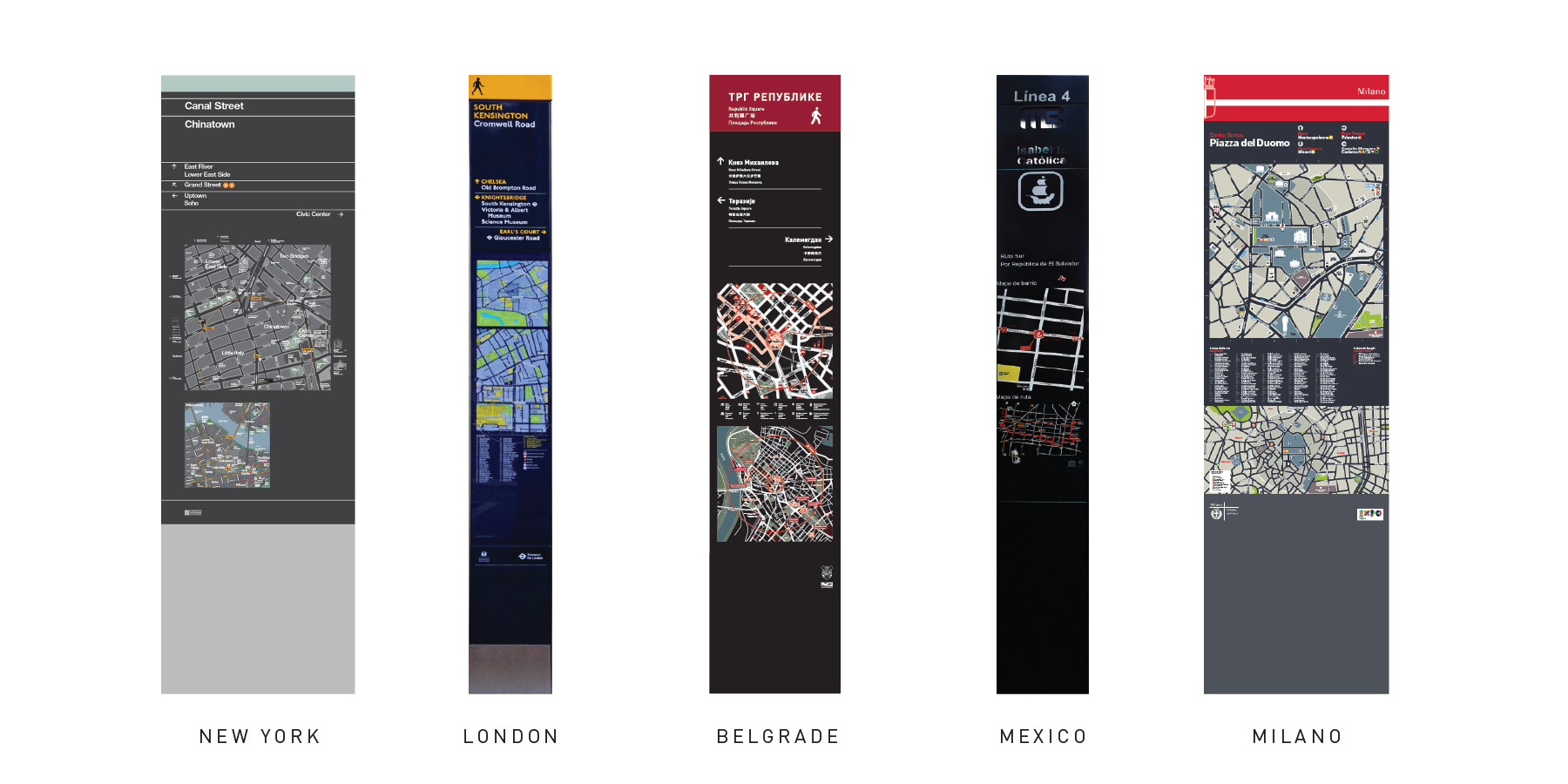
The shape and color requirements clearly placed the soon to be designed totems inside the thriving worldwide family of similar monolithic wayfinding stelae.
With the scope of work defined we allocated tasks to each team:
- Alma Quattro will handle industrial design and production
- My team will design the graphic interface (Maps, labels...)
- Together we will determine the position of the totems inside the urban matrix
Part 2. Master the Matrix
Read the flow
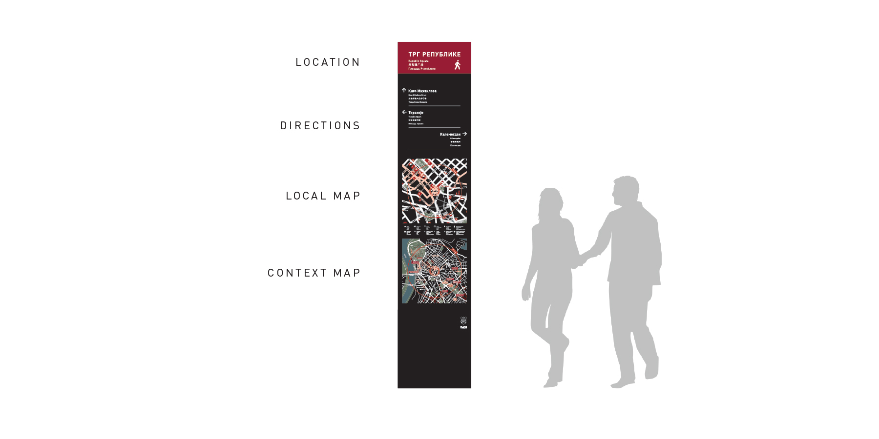
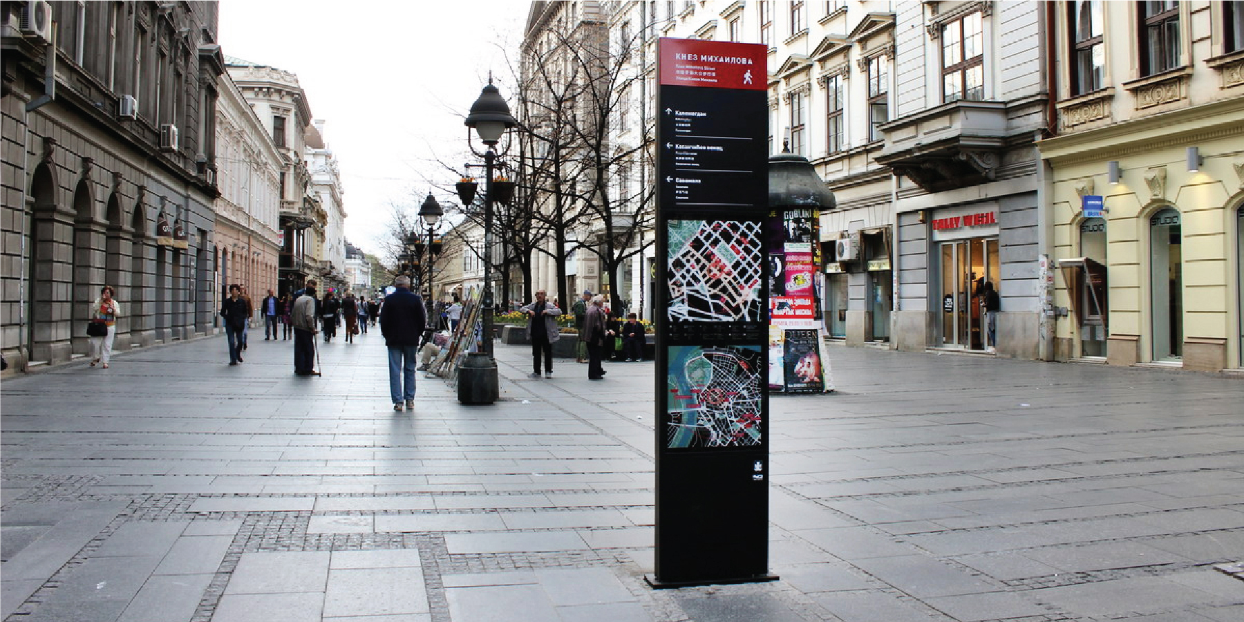
The top part of the totems features the name of the spot where the totem is located (dark red field) and a limited number of main directions around it (black field).
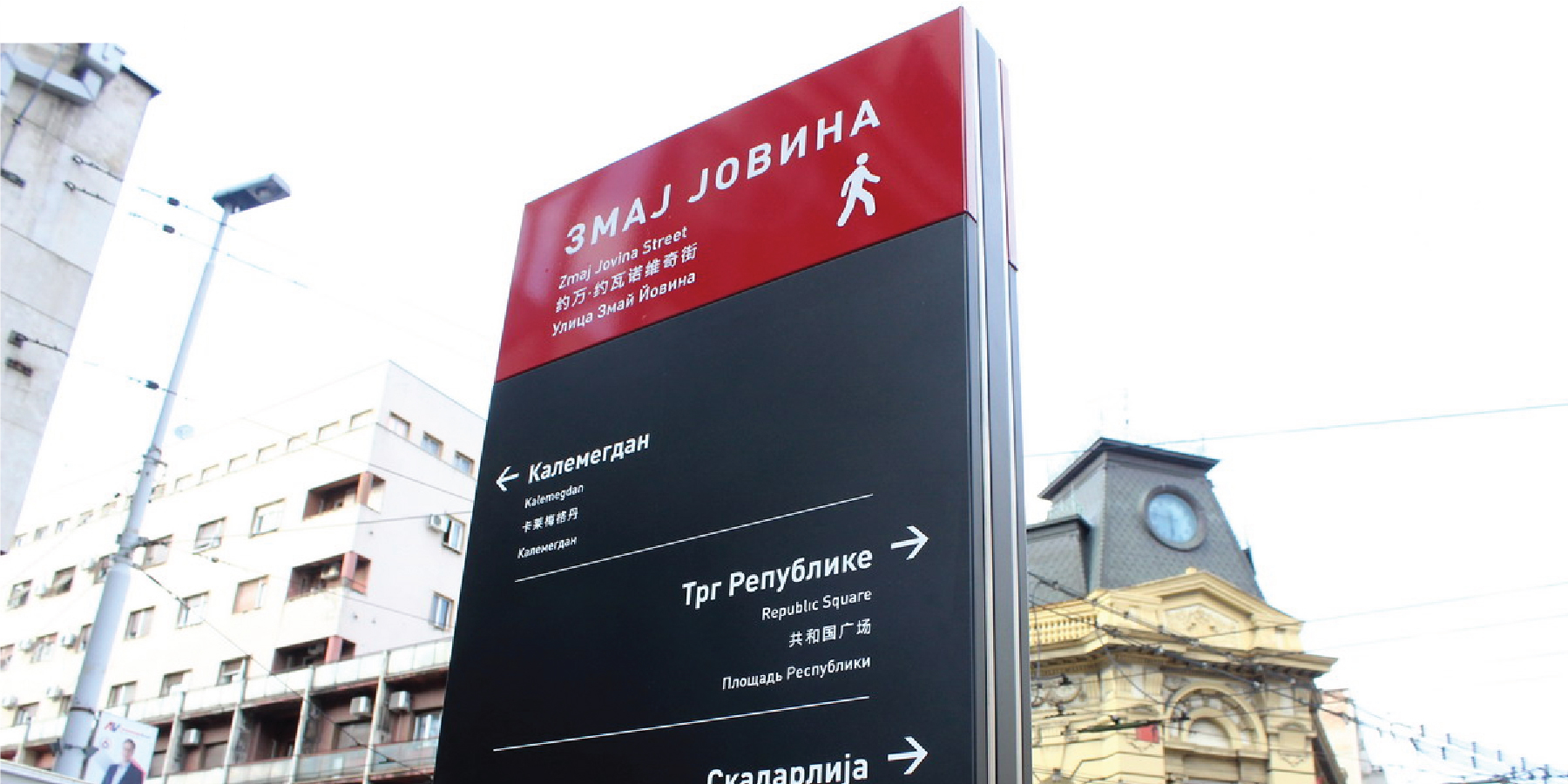
Our common task was to determine the optimal position for 30 totems inside the historic city center. We had to identify and understand the flows of people going through the street matrix and the major attraction points where these flows converge.
Placing totems inside this intangible network is like placing acupuncture needles on a body, except the body here is the city and the bodily energy flow is the flow of people in the streets. Each totem is there to smoothly orientate and balance the flows.
Starting with 12 selected attraction spots we figured out a matrix of relationships between them. From each of these locations, directions on totems will point to the related spots in the matrix thus
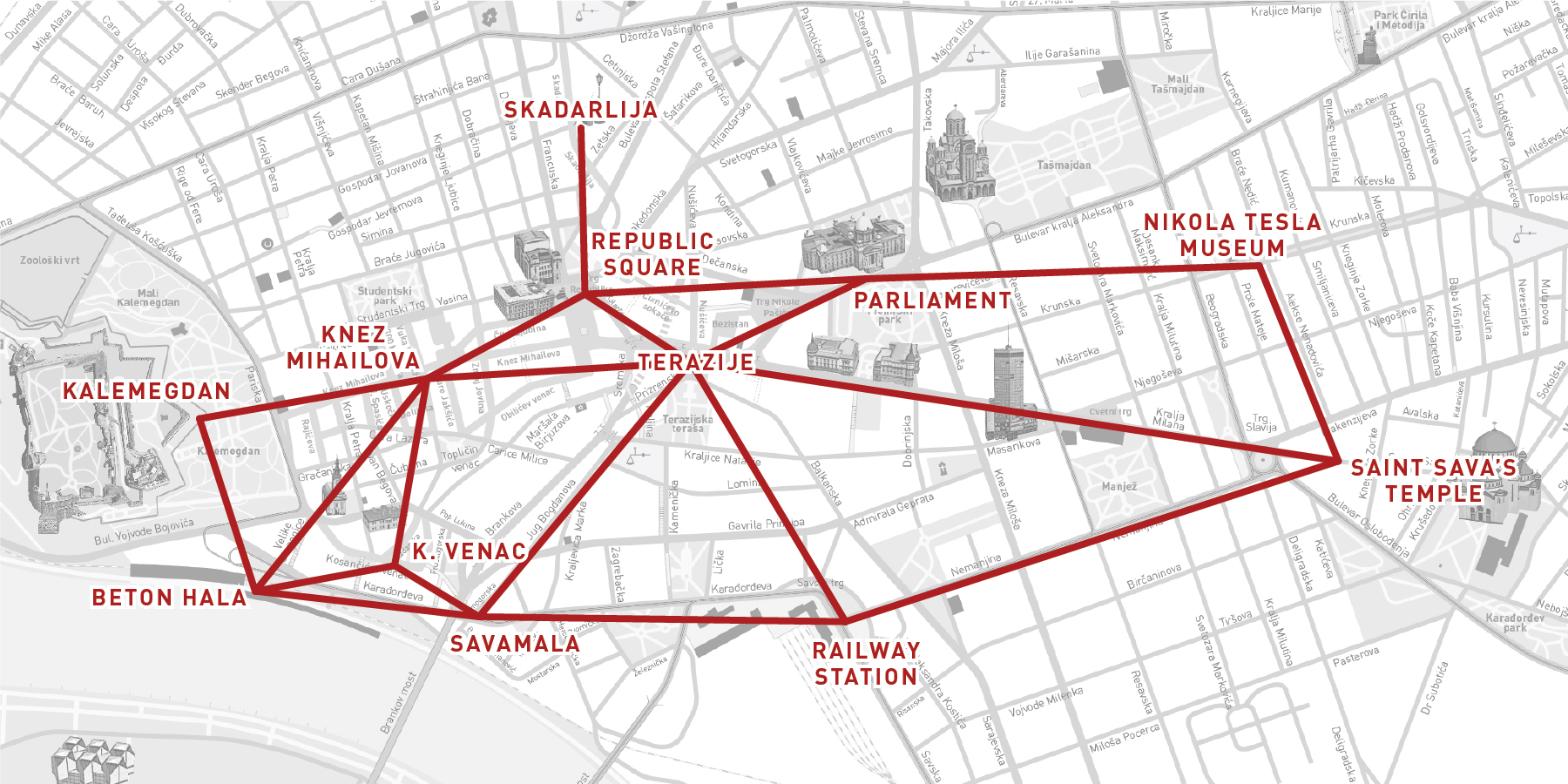
We then allocated totems to each part of the matrix based on the pedestrian flow density and street pattern shape.
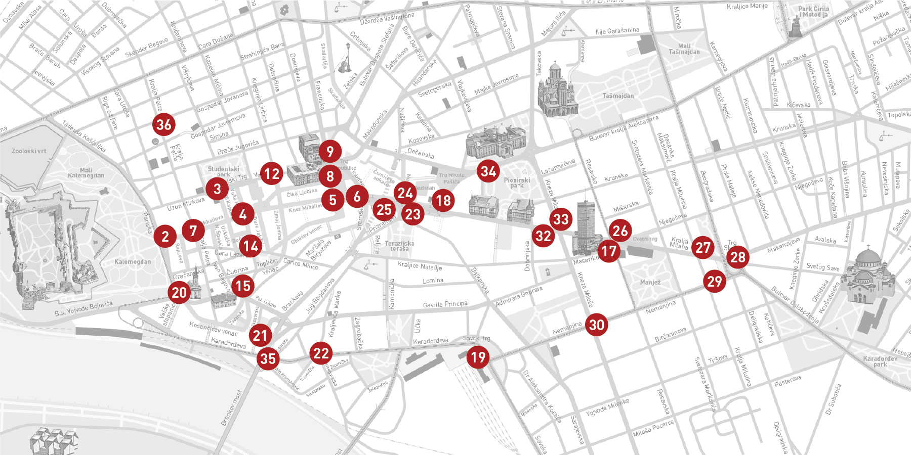
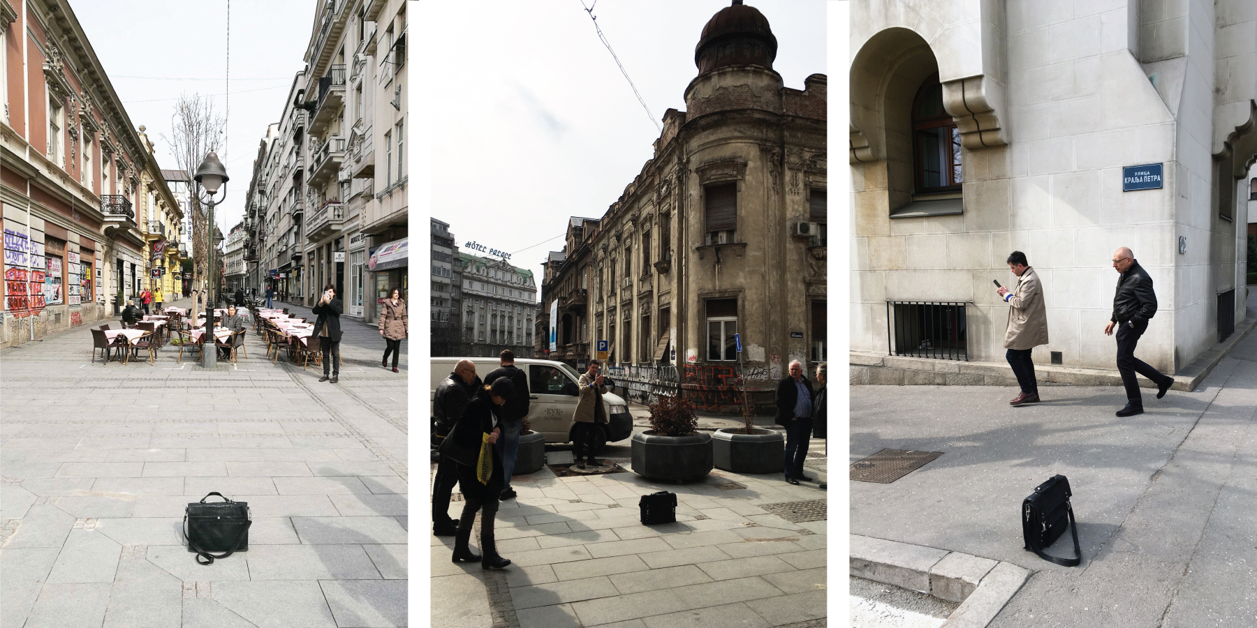
Finally we visited all potential spots to determine the right local position and orientation for each totem, consistently with its role inside the matrix. We took particular care to conform to the city's rules for urban furniture placement and to avoid conflicts with existing or future infrastructure (above and below earth), after all we had 3 architects in the combined team.
The black bag on the pictures marks the position and orientation of future totems.
Part 3. Compose The Map
The role of the totem is threefold:
- Tell you where you are
- Point to the main directions you might want to follow
- Reveal the area around you so that you can explore it confidently. That's where we need an adapted map.
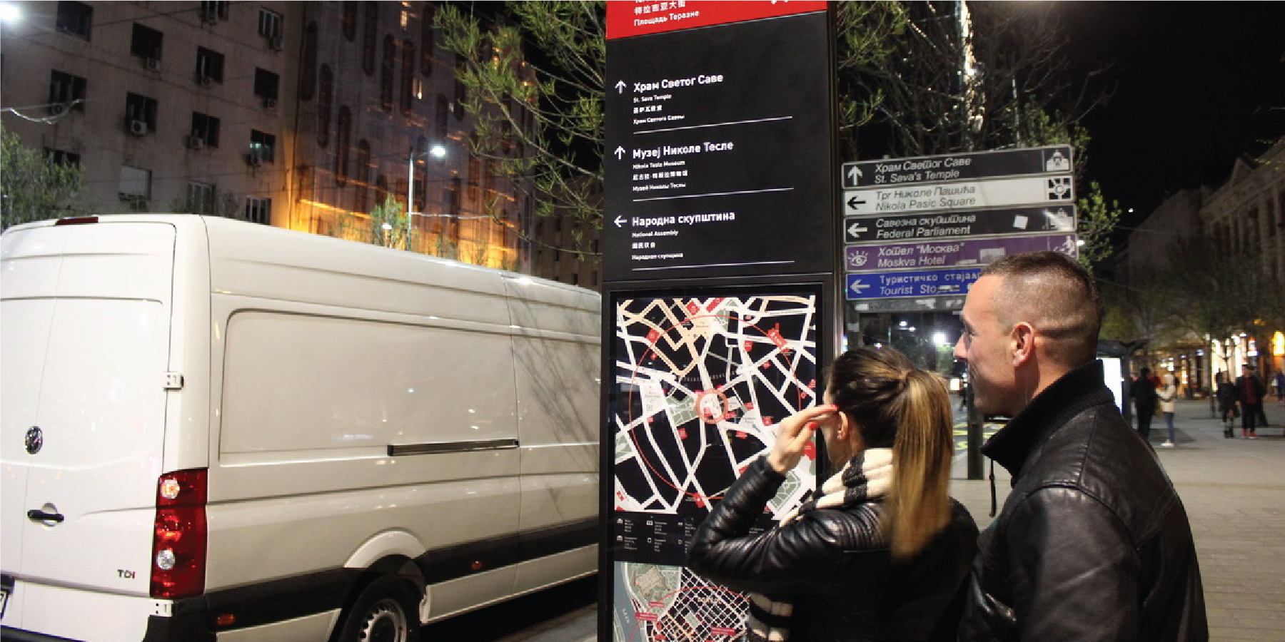
Creating a map that is efficient and friendly at the same time is a matter of balance and hierarchy of information. We wanted a straightforward map that could be easily read outdoors and that wouldn't overwhelm the users with unnecessary details.
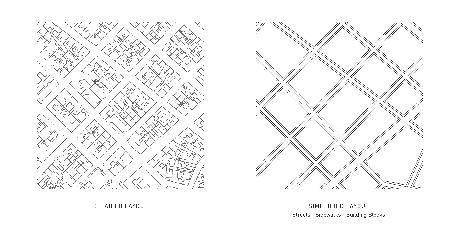
The basis of an urban map is the public space layout so we set off to simplify it as much as possible. Complex building shapes are schematized into simple polygons, streets are straightened and their widths evened with main streets wider, sidewalks are added everywhere. These sidewalks will connect to squares and pedestrian streets.
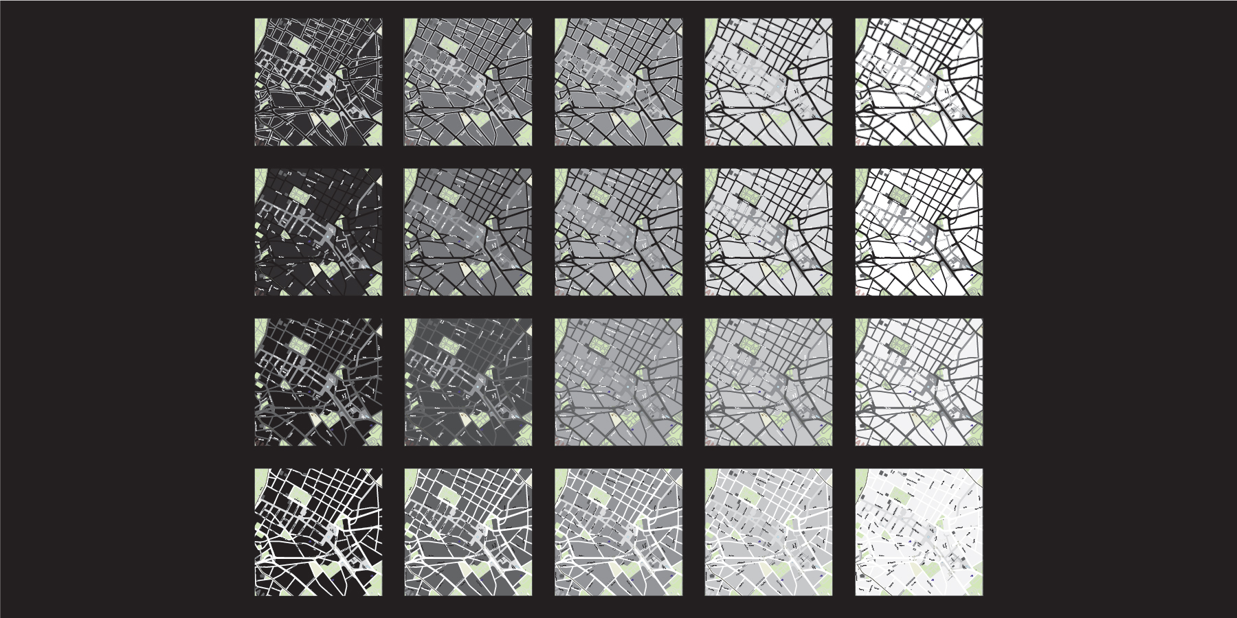
With the number of basic elements of the map reduced to 3 - causeways, pedestrian space, buildings - the next step was achieving a balanced contrast between them. As the monolith was set to be black we chose to make it as simple as possible and use only black, grey and white on the basic map. Dark red would be used later to highlight important landmarks.
Building blocks occupy most of the map's surface so setting them to black merges them with the monolith's equally black background and highlights the public space pattern meandering between them. Consequently pedestrian space was assigned grey and causeways white (bottom left square).
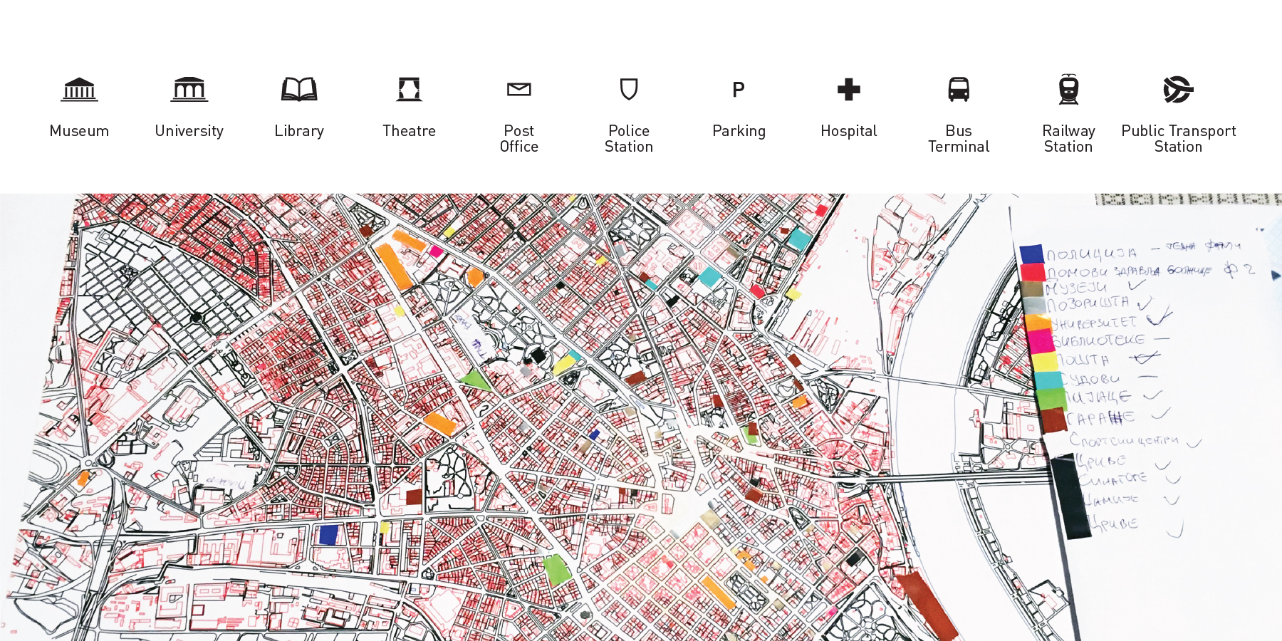
On top of the basic map we then added useful information: buildings and services. We first listed them all, organized them into categories, created pictograms for each one of them, placed them on the map and eventually discarded the categories that cluttered the map without providing essential information. A time consuming hand work, necessary to ensure the quality and accuracy of the information on the map.
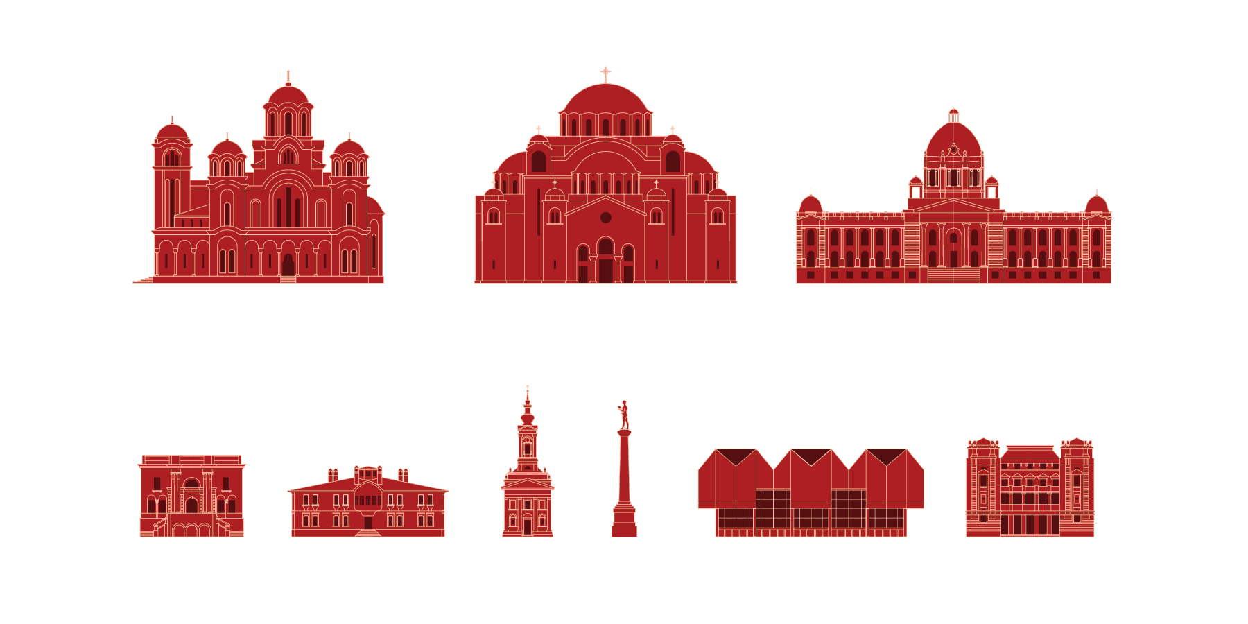
Last we added custom made drawings of the major landmarks. They help intuitive orientation and add a flavor to the map conveying the unique identity of the city. The landmarks are placed on the context map (15min walk area) with labels in Serbian and English.
The historic center's pedestrian area is further highlighted with a salmon pink overlay and a circle shows the approximate distance one can walk in 5 or 15 minutes from his current location.
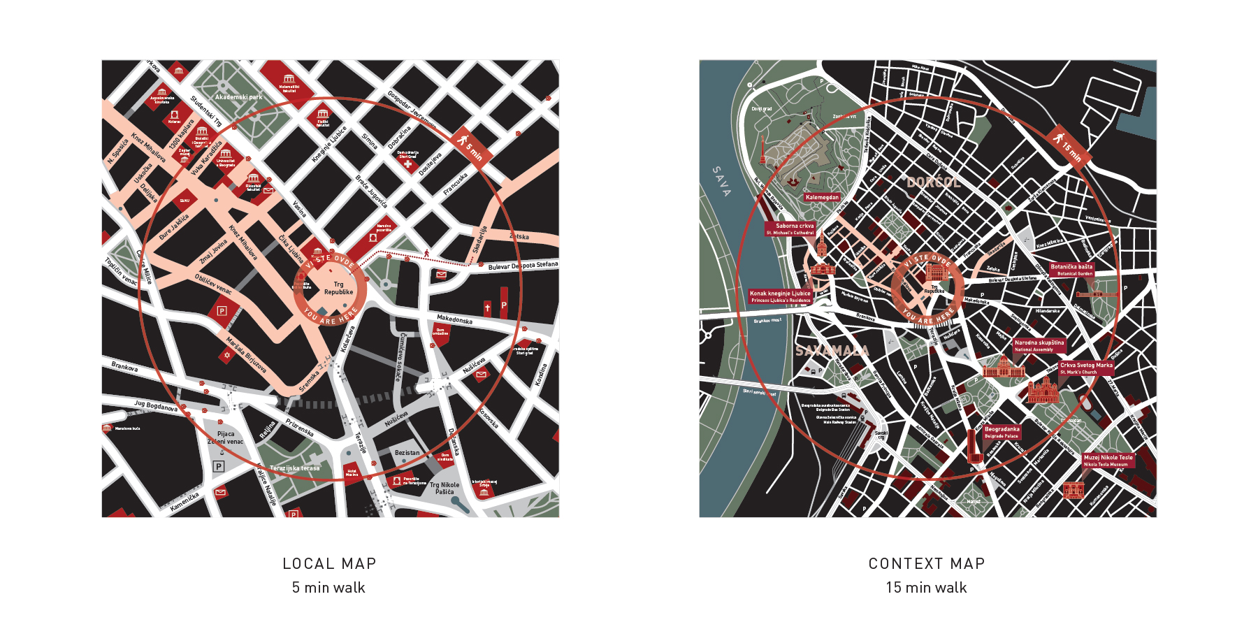
With the master map and all graphic elements ready, we proceeded to make particular maps centered on the location of each one of the totems, correcting the placement of street names and landmarks to fit the different layouts.
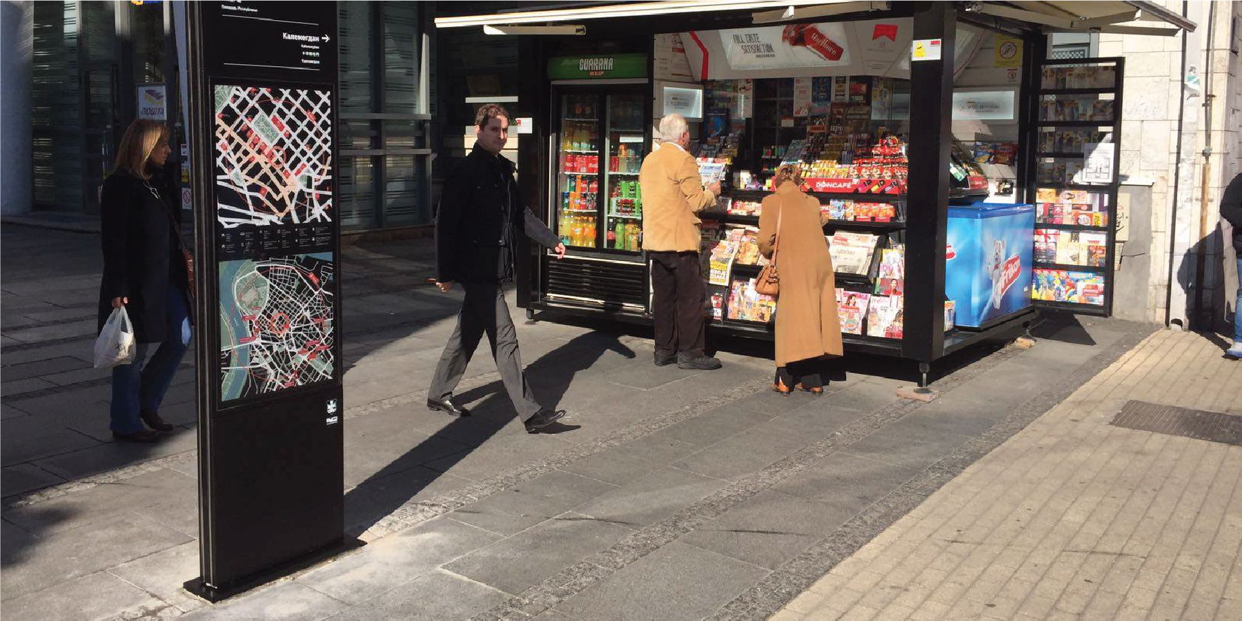
Part 4. Build, build, build
The totems are made of steel with a sturdy internal structure supporting the outer panels. They were produced in Serbia, delivered on the designated spots where the foundations had already been laid, and fixed to the ground.
Night time work allowed for fast and secure implementation of the totems in otherwise crowded pedestrian areas.
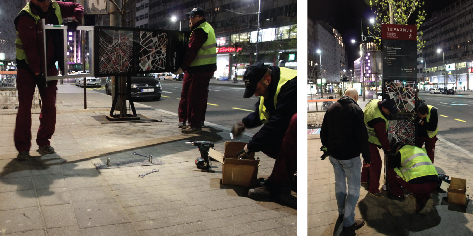
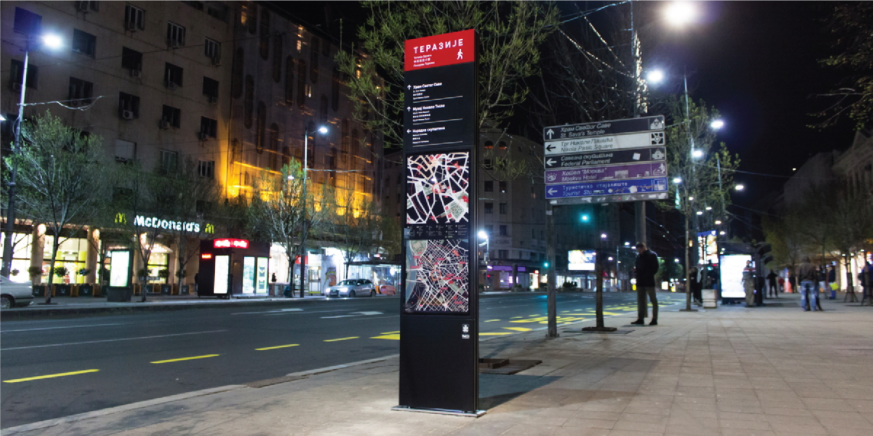
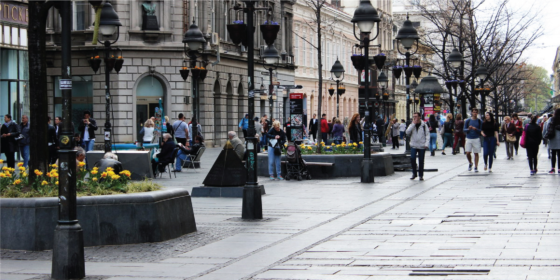
Belgrade woke up to discover a beautiful new element of the cityscape and we could proudly take some rest after successfully achieving the challenge.
Part 5. What's next?
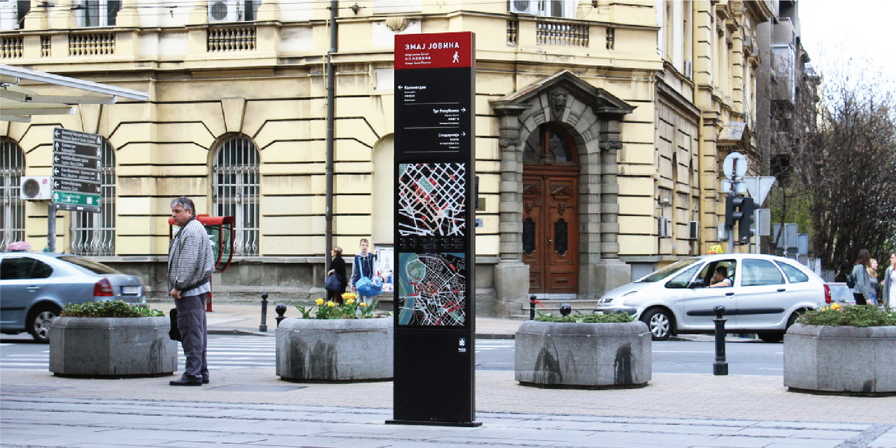
The new totems have received a warm reception and widespread congratulations and we are now set on enlarging the matrix and placing 120 more totems all around the city.
The totems will also be supplemented by our new public transport maps along with local maps to be placed on public transport stations.
Coming soon.
- - - - - -
Authors:
Jug Cerovic Architect
Imamo Plan
Stefan Milojevic Architect
Marko Njegic Analyst
Alma Quattro
Zoran Ljubicic Architect
Vladimir Avramovic Development manager
Realization:
March 2017
